Art
October 29, 2020
Shop MCA Denver call for artists: the incredible, out of this world, totally rad design submissions
A few weeks back we put out a call for artists to submit a design for an exclusive and limited edition MCA Denver branded t-shirt, asking artists to create work that represented their interpretation of or experience at the museum. We were thrilled to announce that we selected a winning design by Boulder artist George Bangs, but we wanted to feature all of the design submissions, because (real talk) it was beyond challenging to pick a winner. We wish we could make more than just one into a t-shirt!
A heartfelt, massive, mushy thank you to all of the artists who submitted your designs. We’re so lucky to have you in our orbit as a part of the MCA Denver community, and we hope you submit your work again in the future!
George Bangs, @terrifficos
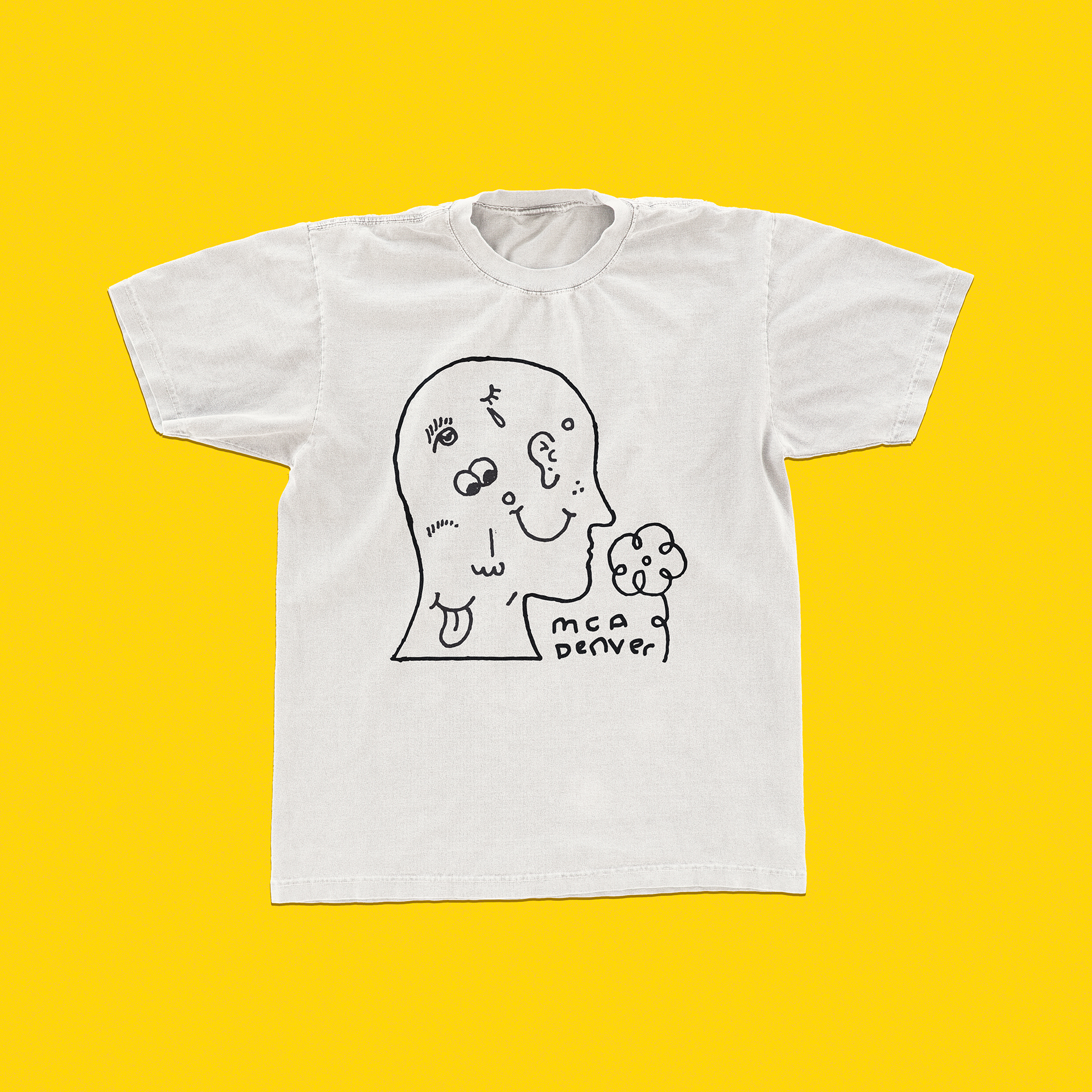
I wanted to make a shirt that illustrated the range of reactions I've had at any given MCA event. The mish-mash of wobbly feelings and faces represents the feelings that come up for me when I get to spend some time with the music or a work of art, and the flower is a placeholder for the broad spectrum of emotional and aesthetic input.
Sierra Montoya Barela, @smbarela
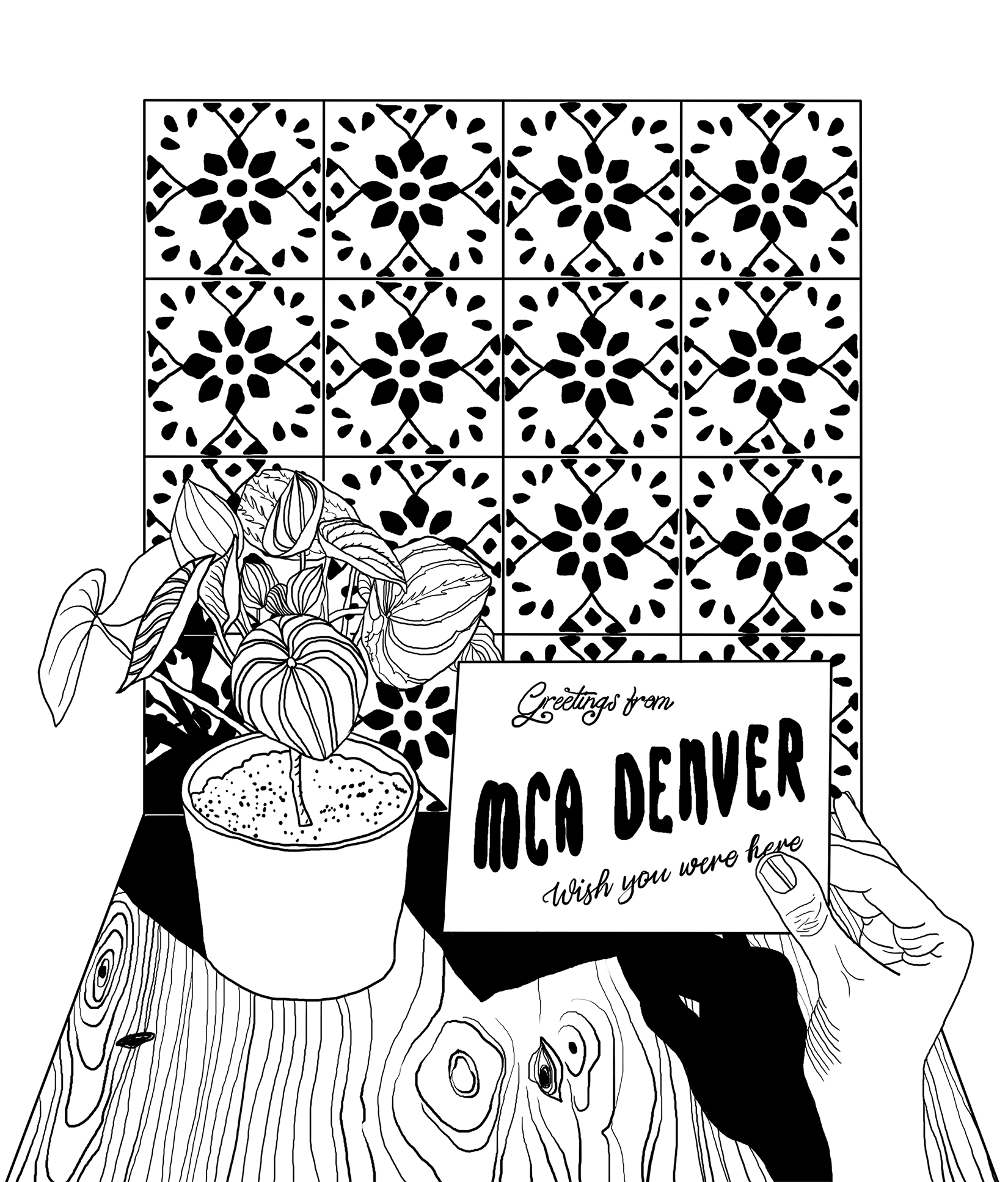
I wanted my t-shirt design to be less about the actual space of the MCA Denver and more about the spaces that the MCA Denver reaches. The viewer is holding a postcard from the museum in their home with the phrase "Wish you were here" - a sentiment we're all feeling in some way or another right now.
Erin Lucey, @coffee_being
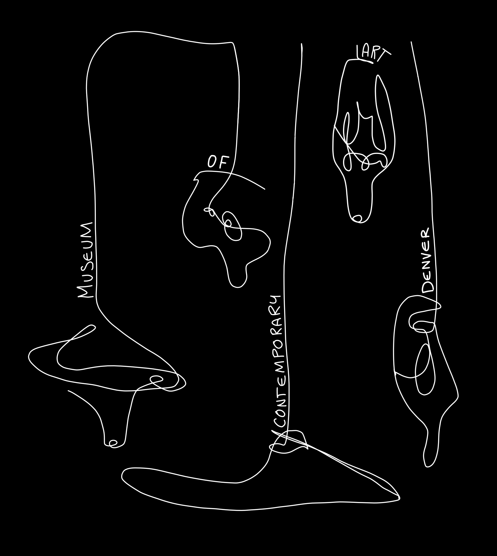
In January of 2018, I visited the MCA for the first time. All of the work within the museum was exceptionally well curated and thoughtful, but the work of Saber Acomodar resonated with me especially. Near a vast window looking over the snowy streets, were warm, inviting lamps, suspended from the ceiling. For my t-shirt design, I incorporated the whimsical nature and form I found in Acomodar's work and utilized blind contour drawing methodologies to further abstract the imagery. The final work effectively suggests the beauty of interpretation in contemporary art and invites the viewer to dive into their own experiences at the MCA.
BANNED DESIGN CO., @bannedesign
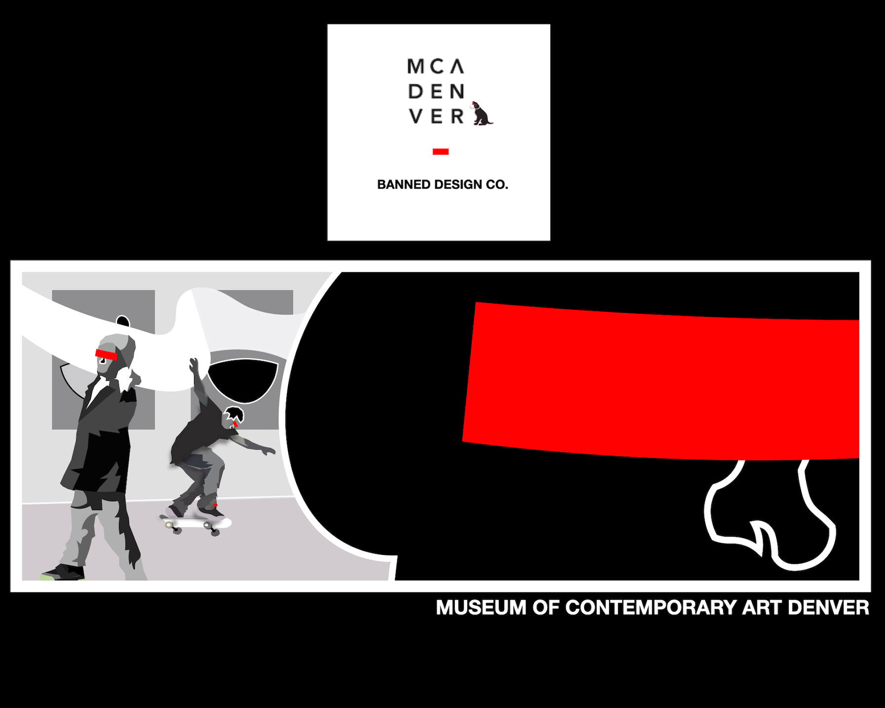
The design for the MCA collaboration came from an overall feeling every time I entered and wandered the museum. The space provides a great sense of community I enjoy experiencing each time I visit. All of this work is from digital construction, but the reference came from multiple voyages through the museum physically, and mentally. As I am from Denver, this art museum has always been a way for me to get away even for a moment, usually you can find me face to face against canvas.
Andrew Stratford, @a_strat10
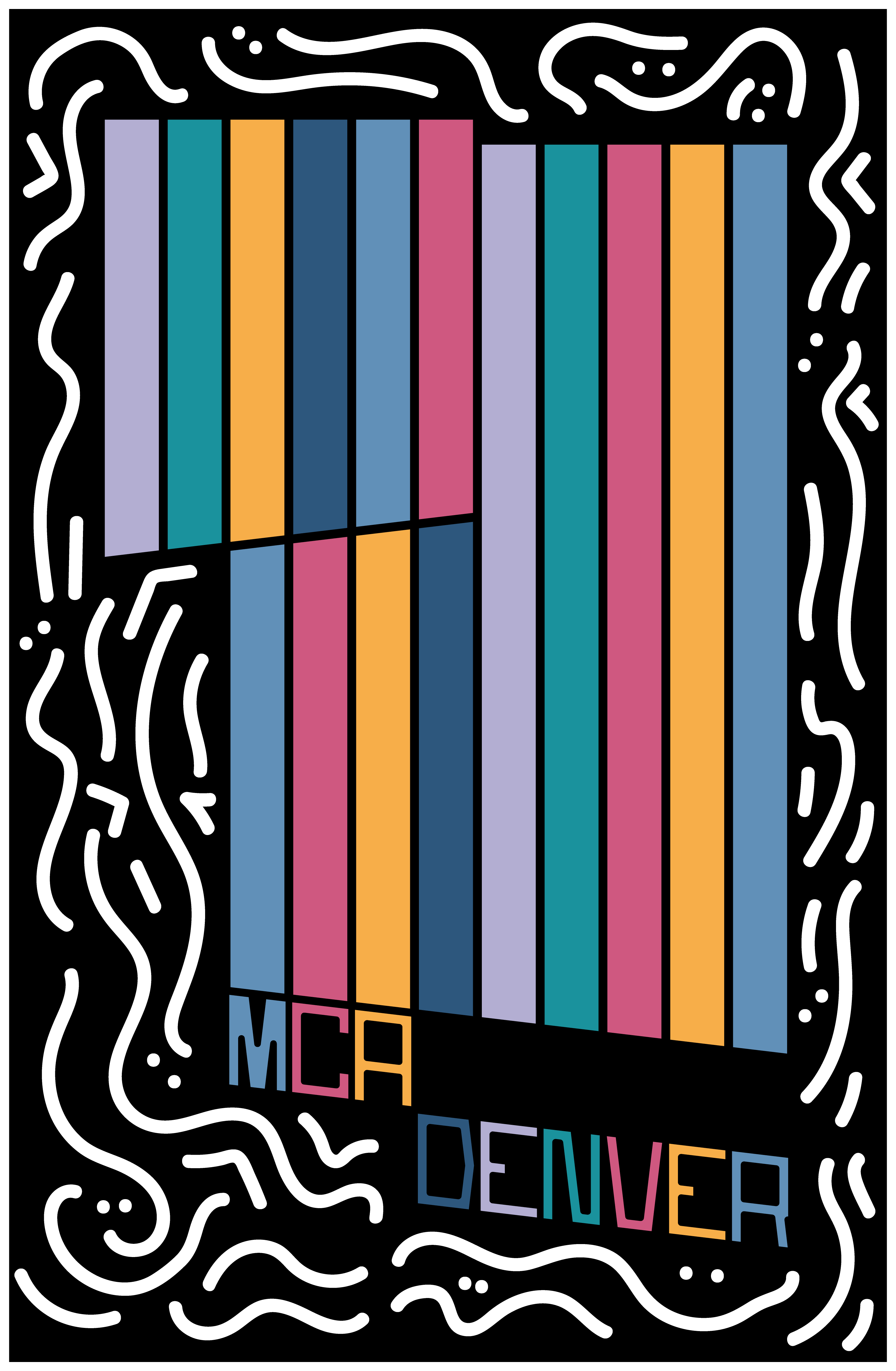
I was at odds because I realize that we are living in such a pivotal time for humanity when it comes to our health, equality, and future prosperity, and design in any form, even on a T-shirt has the ability to make positive, substantive change. With my head whirring and as an aspiring architect, I found comfort first in making the shirt black of course, and second in focusing on the building itself. The plan of the building is simple, with a few distinctive, but elegant moves so I decided to utilize its shape to ground the design. The colored stripes running vertically in the building outline illustrate the beauty, diversity, and vibrance of not only the artists and artwork on display inside, but also of the people in the community. Art and design is truly at its best when all persons have a voice and are able to share their own unique stories. The white squiggles around the building show the playfulness and activity that the building and artwork bring to the city of Denver. Hidden smiles and various twirls create a spirited journey around the building. Artwork and even T-shirt design has power in making the world a more thoughtful, happy place to live and thrive together.
Kyoko Caulfield, @honey.lemonade
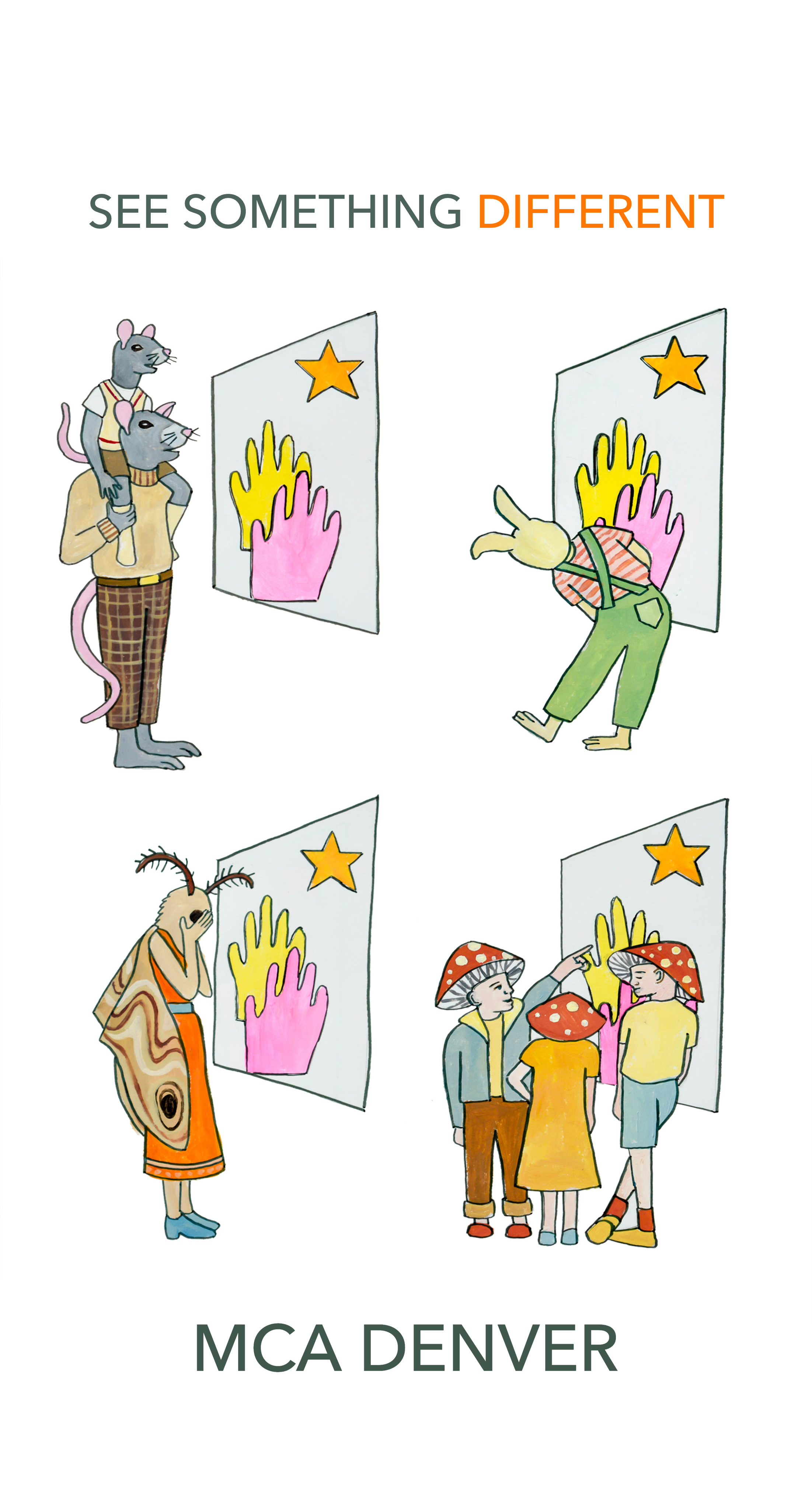
For this t-shirt design, I wanted to convey the idea that a single piece of artwork can be viewed many different ways. I depicted one painting on the wall, but many visitors viewed it with varied reactions. I tried to depict the museum's appeal to a diverse audience by illustrating a range of ages and different fantasy/animal groups. The text on the top can be perceived in two ways: to see something fresh at the museum, something you haven't seen before, or to see something in a new way or a different way than those around you.
Berger & Föhr, @bergerfohr
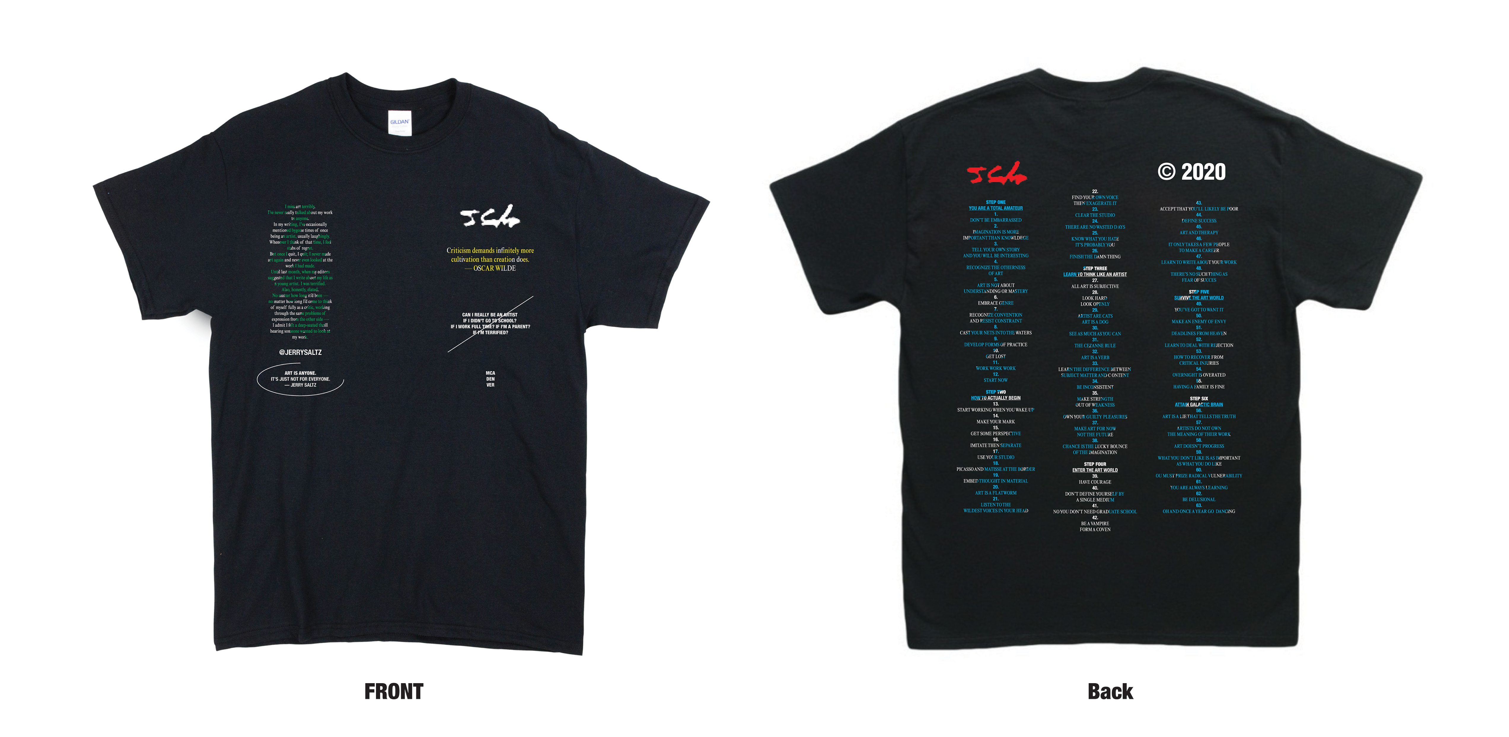
We paid a graphic homage of sorts to Jerry Saltz, as a failed artist, famous art critic, and teacher/mentor to viewers and artists alike. In many ways, Jerry's experiences on both sides of the art world fence all lead up to his recently published book, "How To Be Artist," in which Jerry breaks down the process of being an artist into six significant steps and 63 rather tactical, conceptual maneuvers. The book is a how-to of sorts and a work of art in and of itself. And if taken from the viewer's perspective, and not just the artist's, it provides unique and valuable insights into how one might more deeply consider and value works of art themselves - all being functions of those who made them.
Given that our work hinges on what we consider "meta-recursion," or the notion of making work to critique culturally relevant ideas or things using those same ideas or things in the works, or as the works and then deconstructing those things through a process of serialization. We felt that the concept of an MCA Denver t-shirt paying homage to a failed artist turned critic, turned teacher, turned celebrity art figure, made for a rather interesting and relevant commentary on the status of creating, viewing, and ultimately, experiencing art.
Radda Corbett, @raddaschthestylist
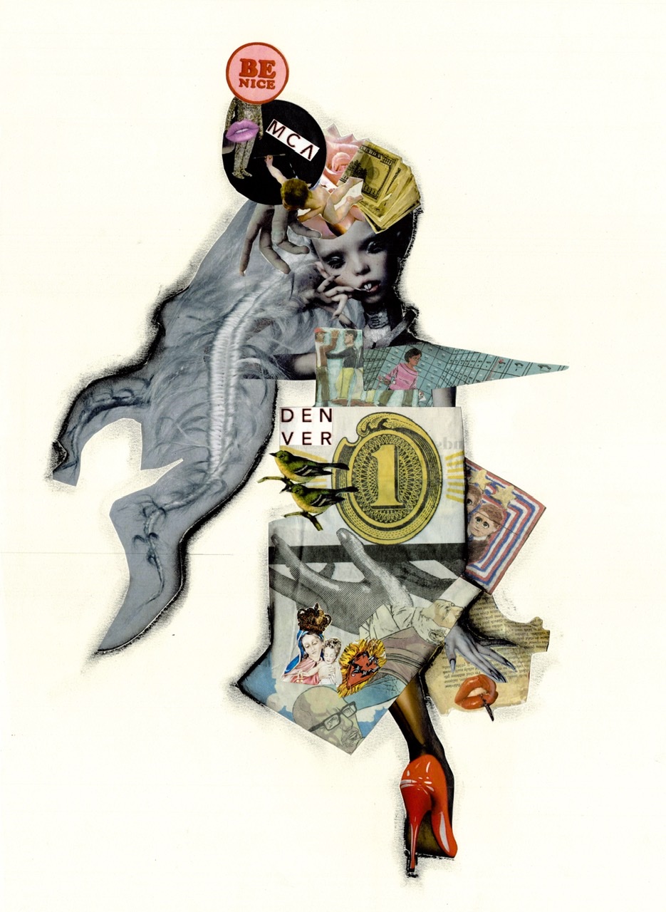
As a fashion stylist, who recently relocated from Germany to the United States, I wanted to create a female warrior of 2020 who represents my personal feelings about cultural differences but also about current instability around the globe. For the museum t-shirt design, I have decided to go with my favorite collage technique. To create the “dress” I have deconstructed architecture of the MCA building while using The Wall Street Journal as main material. For me it was important to express how chaotic 2020 has been so far but still have a positive message about becoming even stronger at the end of it.
Cyanne Stonesmith, @cyannestonesmith
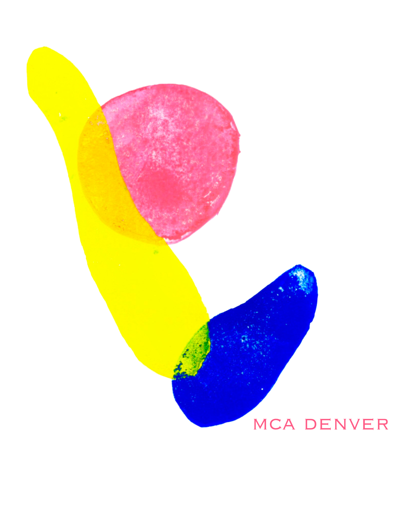
My t-shirt design is an abstract created by a linoleum ink block. This design was inspired by the mirror on the outside of the MCA reflecting a Colorado sunset. The distortion of the image in the mirror is reflected in my print. I was particularly inspired by the mirror encouraging viewers to reflect and re-interpret our surroundings.
Tyree Jones, @TyreeJoArt
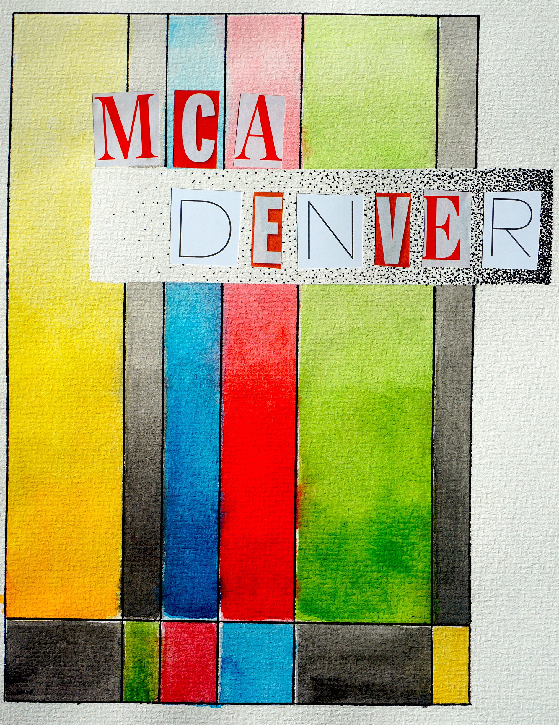
I chose this design because it was based around one of my favorite exhibitions at MCA: Derrick Adams: Transmission. Not only was it my very first exhibition I had visited at MCA, but I connected with it in a way that inspired me and my own work. The bright colors felt very in sync with my work, and how I wanted to portray black and brown people. I was also inspired by Tara Donovan: Fieldwork. Her ideas behind transformation resonated with me in the sense that even the smallest figures coming together in large ways is enough to create a massive change. I feel that during this time while we deal with radical racial stress, it is important to highlight work that allows black and brown people to describe how we would like to be seen. It is also important to unite during times like these to launch these changes that we want to see. These two exhibitions were my favorite and merging ideas from them both allowed me to encapsulate my experiences with MCA, which has proven to be an inclusive and safe space for every artist different and alike.
Rio Dulaney, @riodulaney
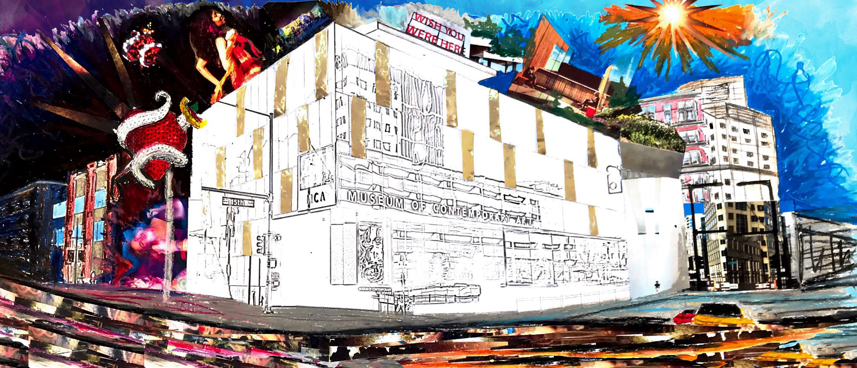
The design for the t-shirt was inspired by the architecture and mission of MCA Denver and represents the cultural icon of the museum, which absorbs the changing culture and environment of Denver. The environmentally sustainable building, designed by David Adjaye, was designed to minimize the boundaries between the exterior and interior spaces. With rotating exhibits, the museum creates a stimulating environment for the art of our time. This t-shirt design represents a museum that changes over time, soaking in the world that surrounds it.
Gabrielle French, @brielle__22
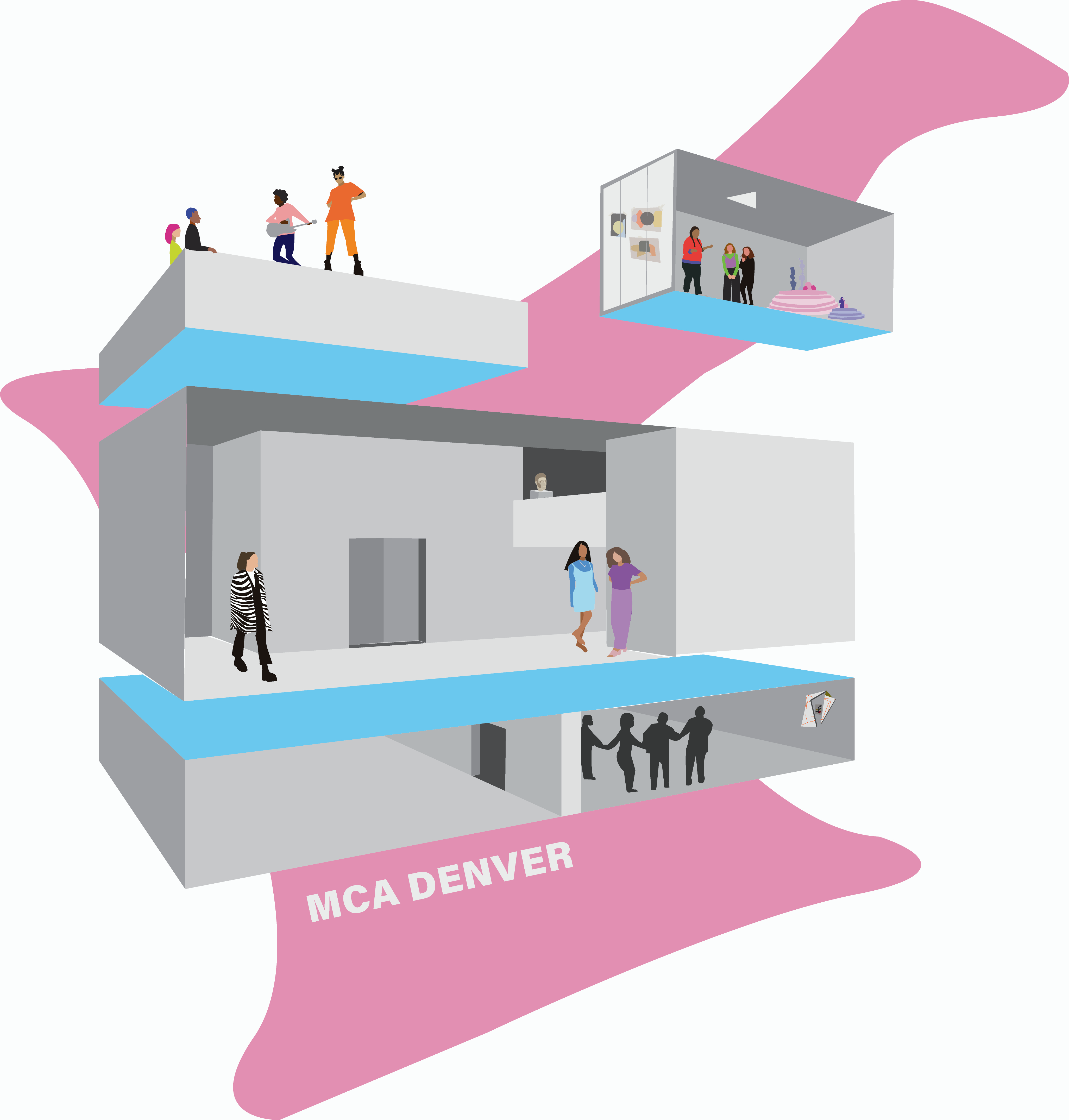
My goal with this design was to capture the spirit of MCA Denver and the wonderful creatives within its walls. MCA is like a second home to me, it’s the place where I’ve spent countless nights soaking in the exhibitions, studying in the cafe, listening to concerts on the roof, dancing at teen parties, and making art in the Idea Box. For me, MCA isn’t just about the art. It’s about the people who are drawn to the art. In this design I abstracted the structure of MCA and filled it with the people who make MCA special. Little details like the collages on the Idea Box windows and pieces from past exhibitions bring authenticity to the design and the imperfect, collage-like style mimics the explorative energy of MCA.
AV + Schmidt.E, @em_schmi, @bookbroad
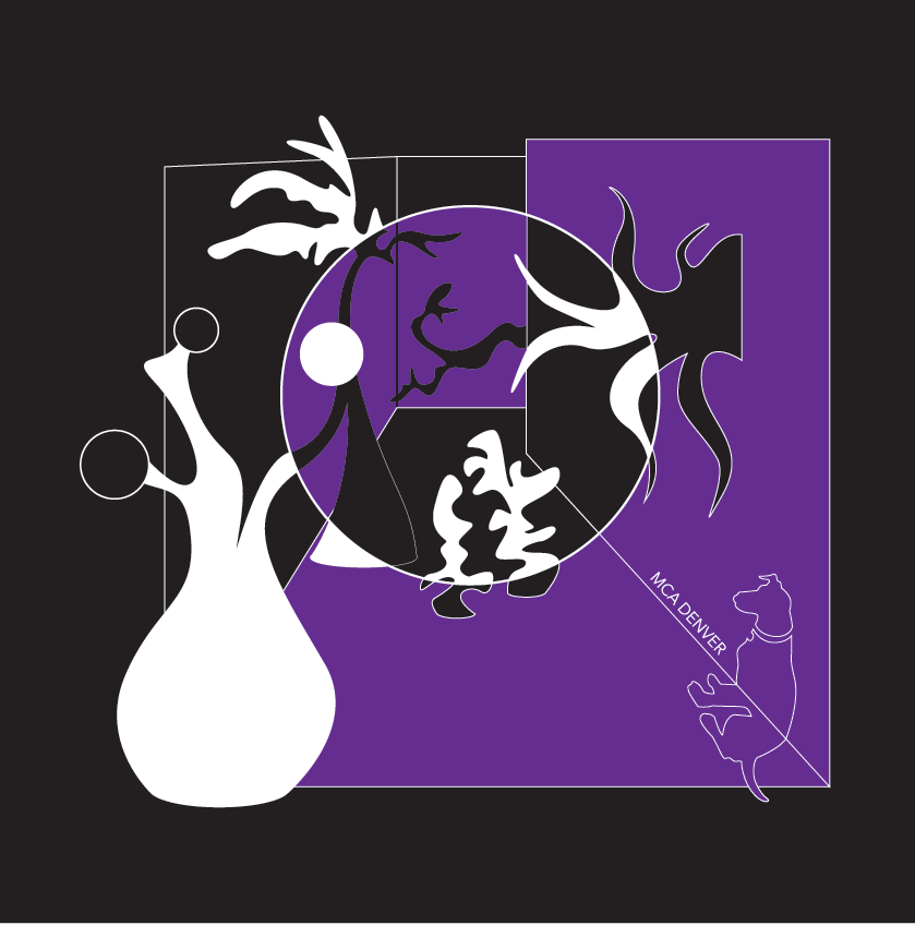
We love the MCA for the dynamic wealth of provocative ideas and community-building opportunities it provides through its exhibitions and programs. As a team we knew we wanted to focus on a design that highlights the entryway, as it never fails to have a significant impact on us as we enter the museum. The entryway for us represents a portal into another place and a site of placemaking: a safe place, an art place, a community place, a place for idea generation and creativity. The portal's minimalist sharp lines and austere finishes allow us to feel this significant moment of transition from the outside space to the inside place of the Museum. This nexus between space and place was something we wanted to celebrate. Our design features a superflat reimagining of the entryway infused with our favorite extraterrestrial flora, which we believe are in spiritual alignment with the joy and whimsy of many of the museum's programs and the community they cultivate, our favorite being One Two Kazoo. Our surreal plant forms evoke the life and bounty found within the museum, and represent the energy and the vibrant role the MCA inhabits in the Denver community. We are so grateful to be a part of this community and for the opportunity to create work that demonstrates our affection for the MCA.
Johnny Costa, @johnnycosta
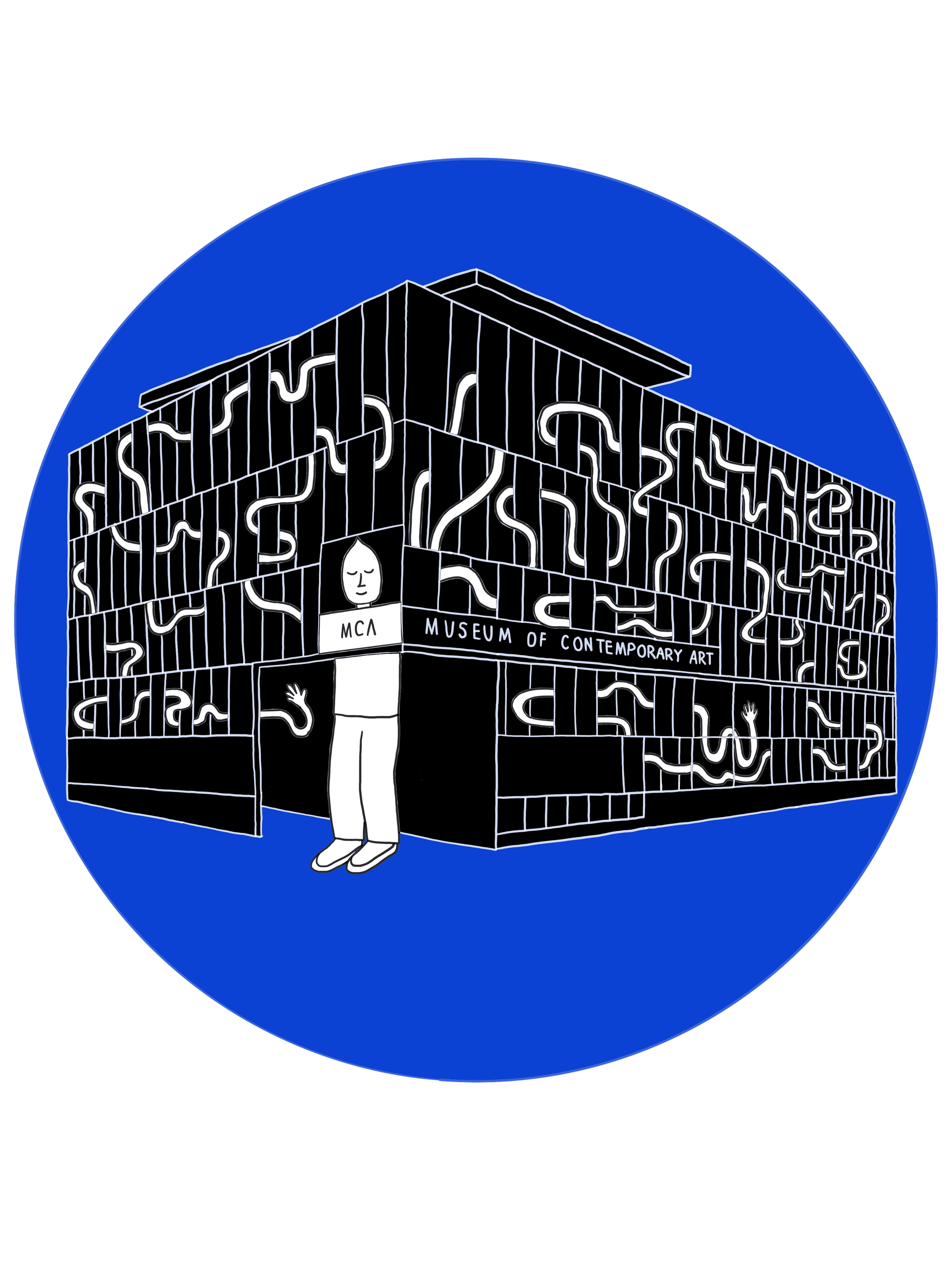
My inspiration for this t-shirt design was a concept of expansion and exploration. I think during these strange times, many of us have had a lot of time for self reflection and self development. I believe museums such as MCA Denver are great places for people to experience self reflection while also expanding their world view and exploring different and new ideas they may have not thought about otherwise. I drew my cartoon character at a large scale to symbolize expansion and his arms are weaving in and out of the museum to symbolize exploration. His head is facing out of the window because he is taking what he experienced in the art museum and integrating it into his daily life.
Monica Jacobs, email: monjacobs@yahoo.com
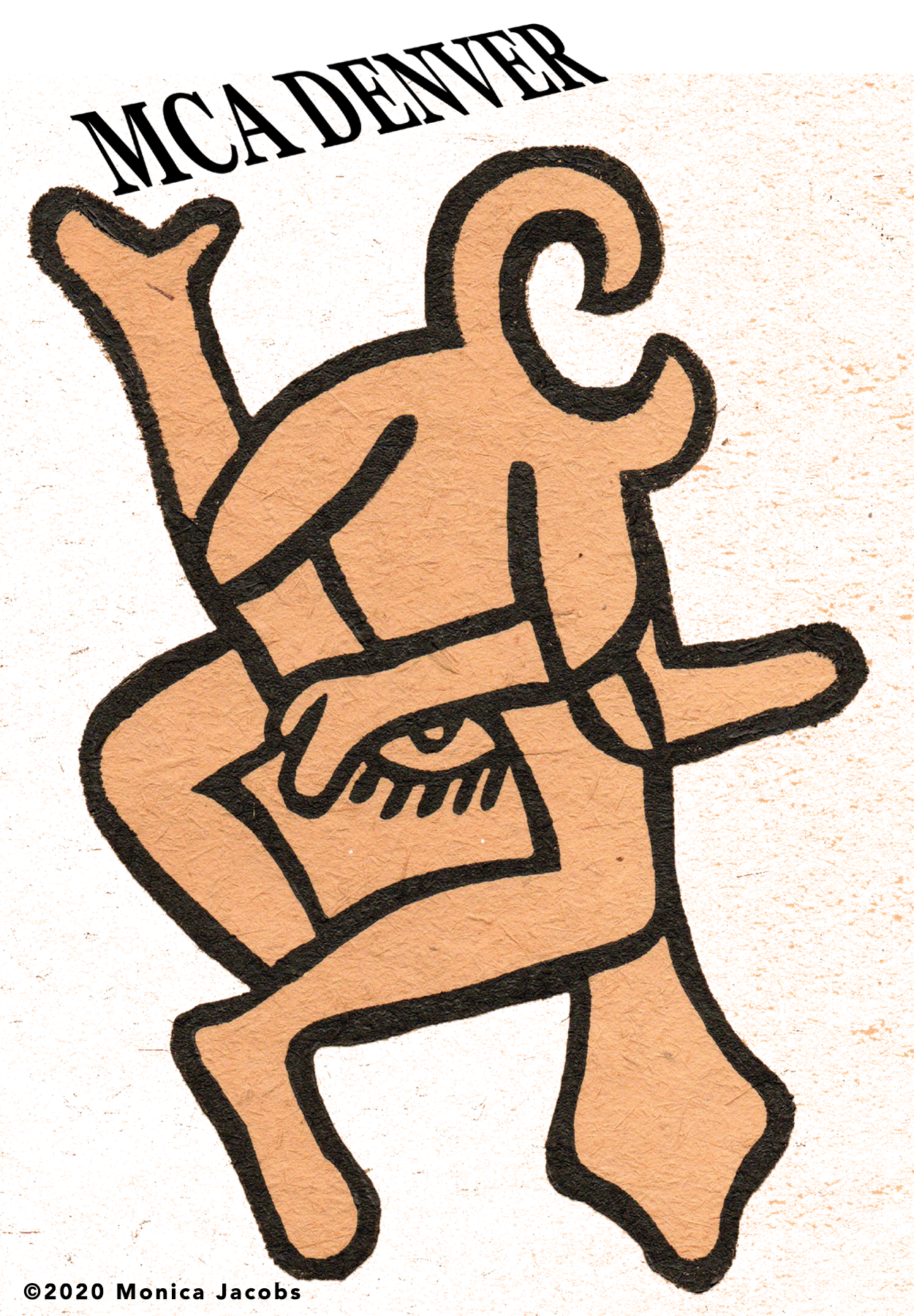
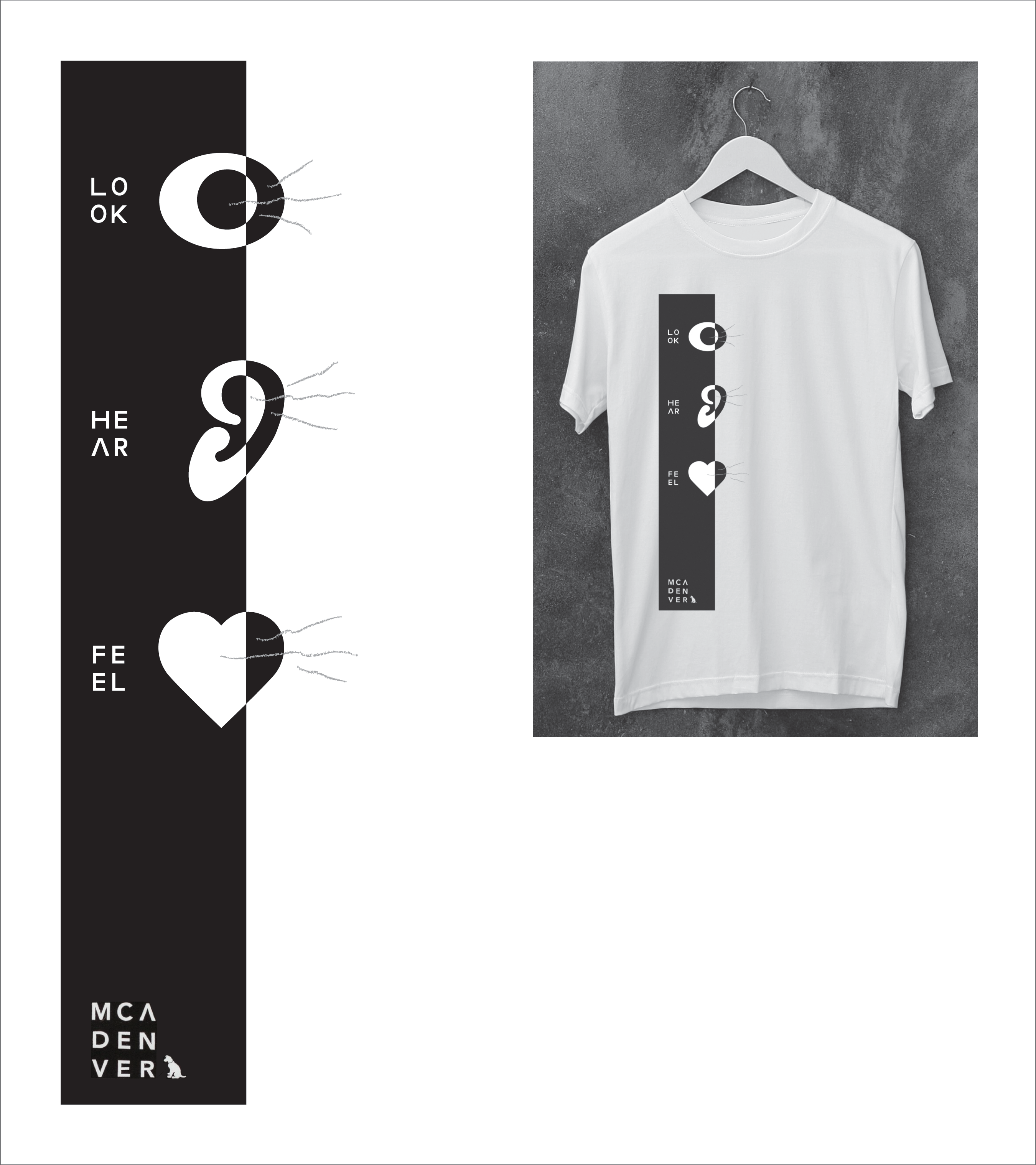
This design is based on the senses. How you may see or feel the museum as a whole and through the individual artworks. As you walk around, how your senses are captivated by the next corner, the next step, the next work. Each sense adding to the experience as a whole.
Drew McLaughlin, @optical_artifacts
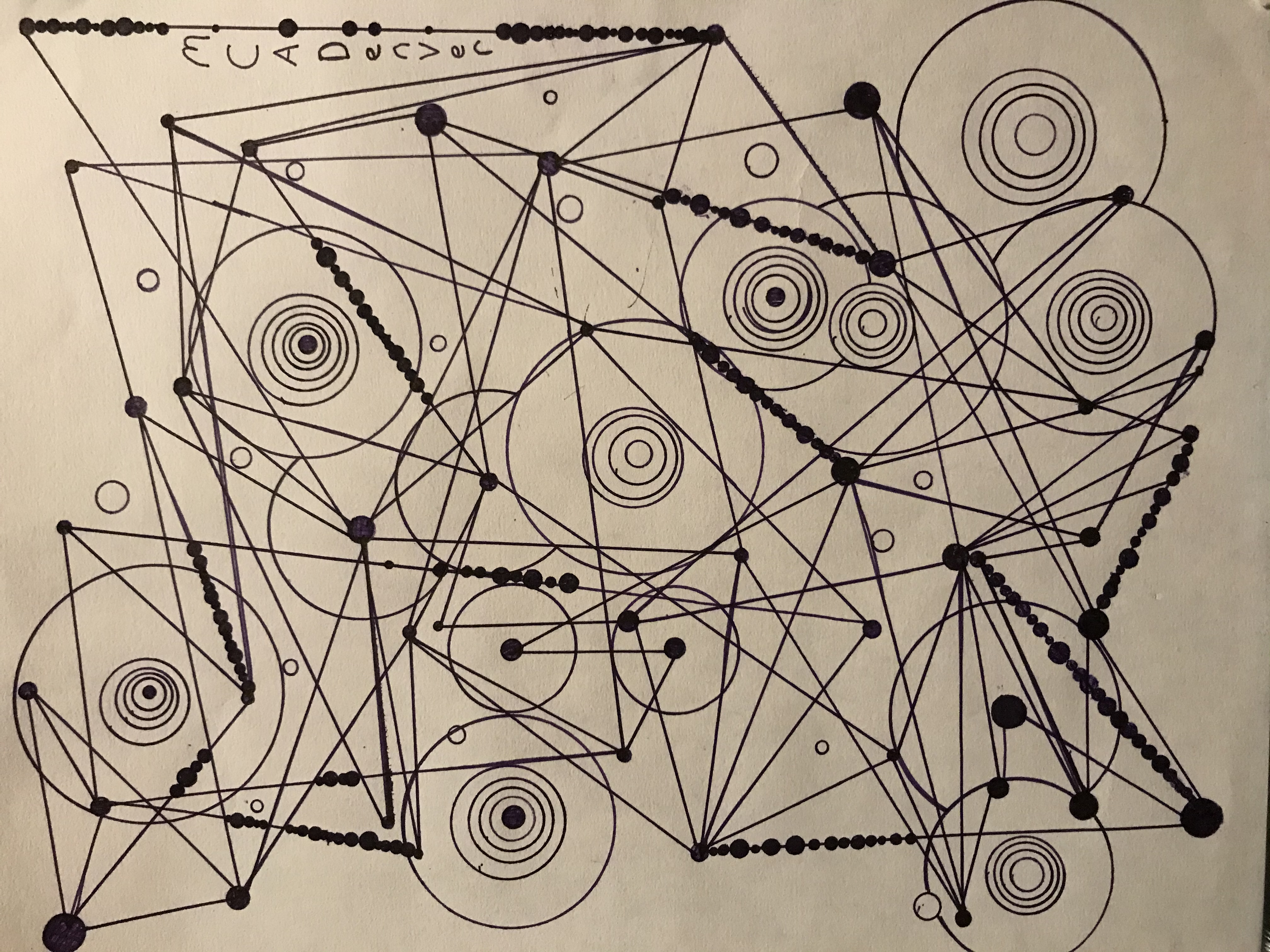
Abstract connections from one idea to another. Tying MCA to the ideas and connections of the community.
Keep your eyes peeled for when we officially release George Bang’s t-shirt in the shop! In the meantime, shop our Fall Gift Set Series on the MCA Denver shop website! We're offer free shipping on the boxes through November (while supplies last).
