Art
November 4, 2021
Shop MCA Denver call for artists round 3: the incredible, out of this world, totally rad design submissions
In August we announced the third round of our Call for Artist T-Shirt Submissions for an exclusive and limited edition MCA Denver branded t-shirt that represented their interpretation of or an experience at the museum, while asserting the design in their own unique style.
Every time the call for artist t-shirt submission comes around, words fall short to describe our appreciation for all of you incredible humans who submit designs. Your creativity, love for the museum, and generosity of spirit never fails to make us all teary-eyed.
We are thrilled to announce that artist Sierra Montoya Barela is the winner of this year’s call!
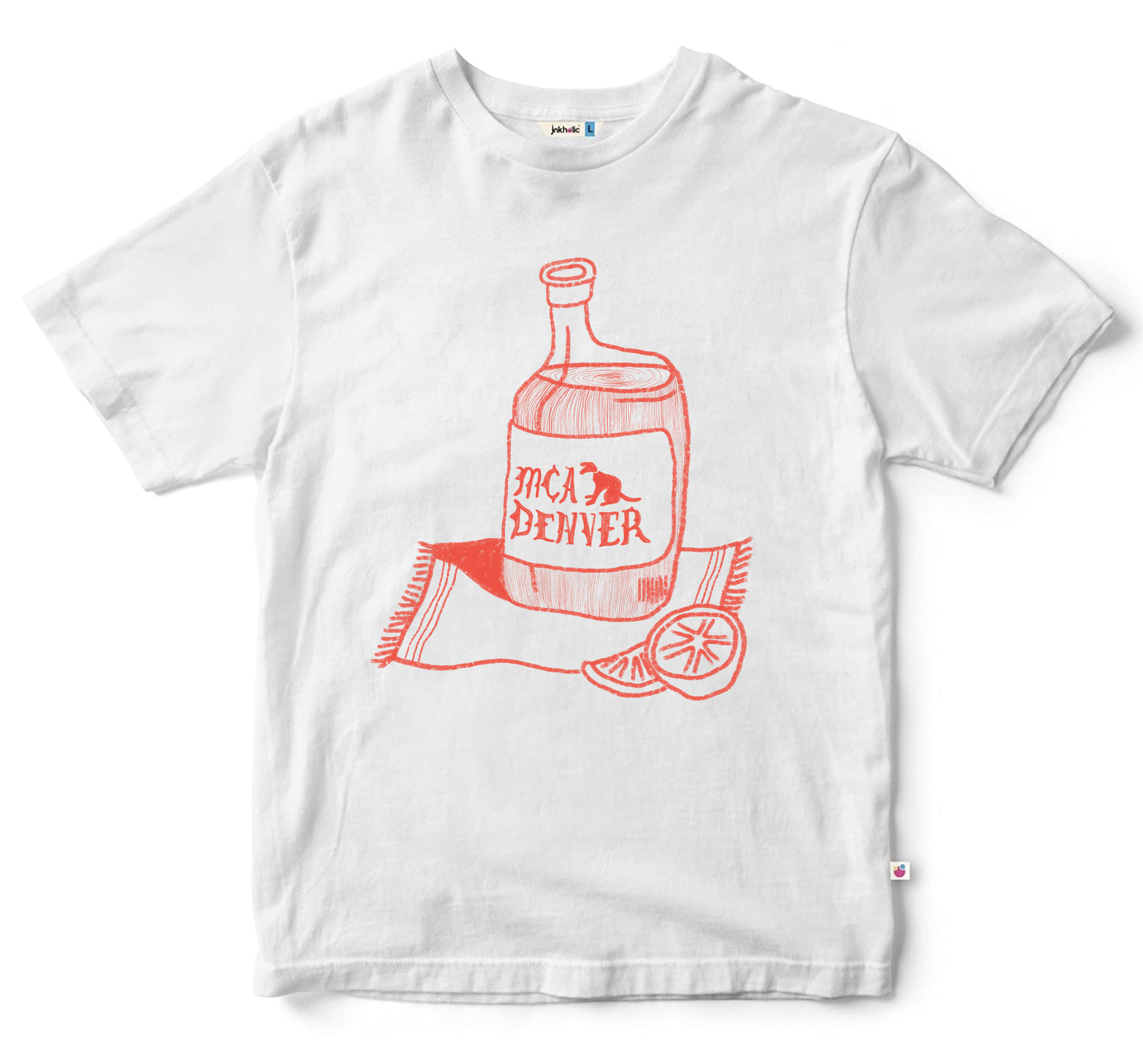
Here’s what Sierra had to share about the concept for her design:
"When I think of the MCA Denver, I think of rooftop opening celebrations, getting together with friends and sharing a drink while talking about art. I picked tequila as the drink of choice for two reasons:In part, as an homage to my Mexican heritage, as well as the ritual of taking a shot of tequila that I think echo’s rituals in artist’s studios as they work. Preparation, the act, and the aftermath. All in all, I just wanted to make a playful drawing alluding to the idea that I’ll have what the MCA is serving. :)"
Preorders for the t-shirt are now available! Now check out all of the other design submissions we were lucky enough to receive!
Elana Hurwitz
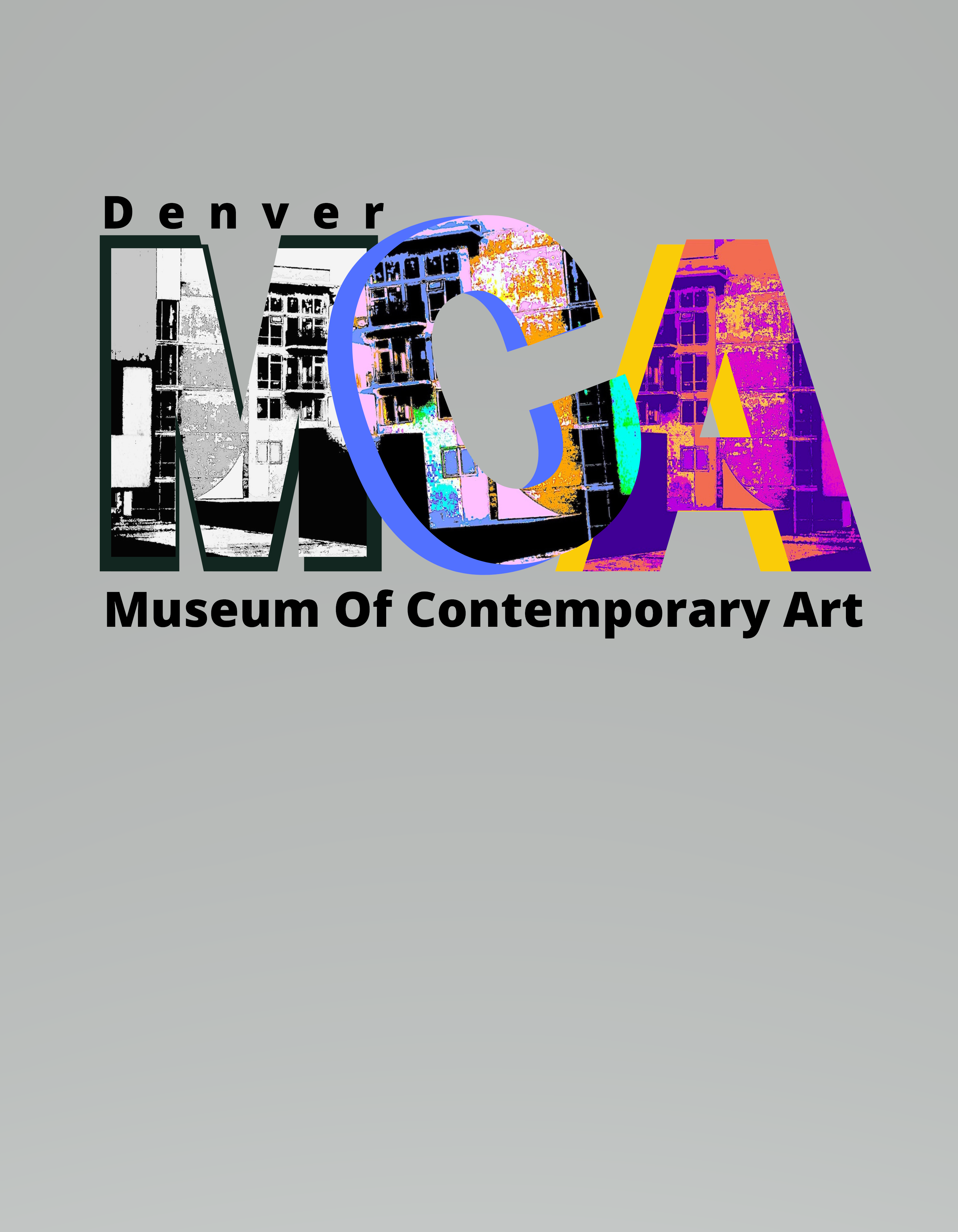
My design incorporates one of the photographs I took while I was visiting the museum. The photograph is a view from the roof top garden. I then worked with my photos digitally to colorize them. I've incorporated this photographic image into the letters of the MCA. The colors I've chosen in each letter represents the types of exhibits I saw at the museum: Black and white photography, bright and lively sculpture and video works, and colorful abstract installations.
Weldon Henderson
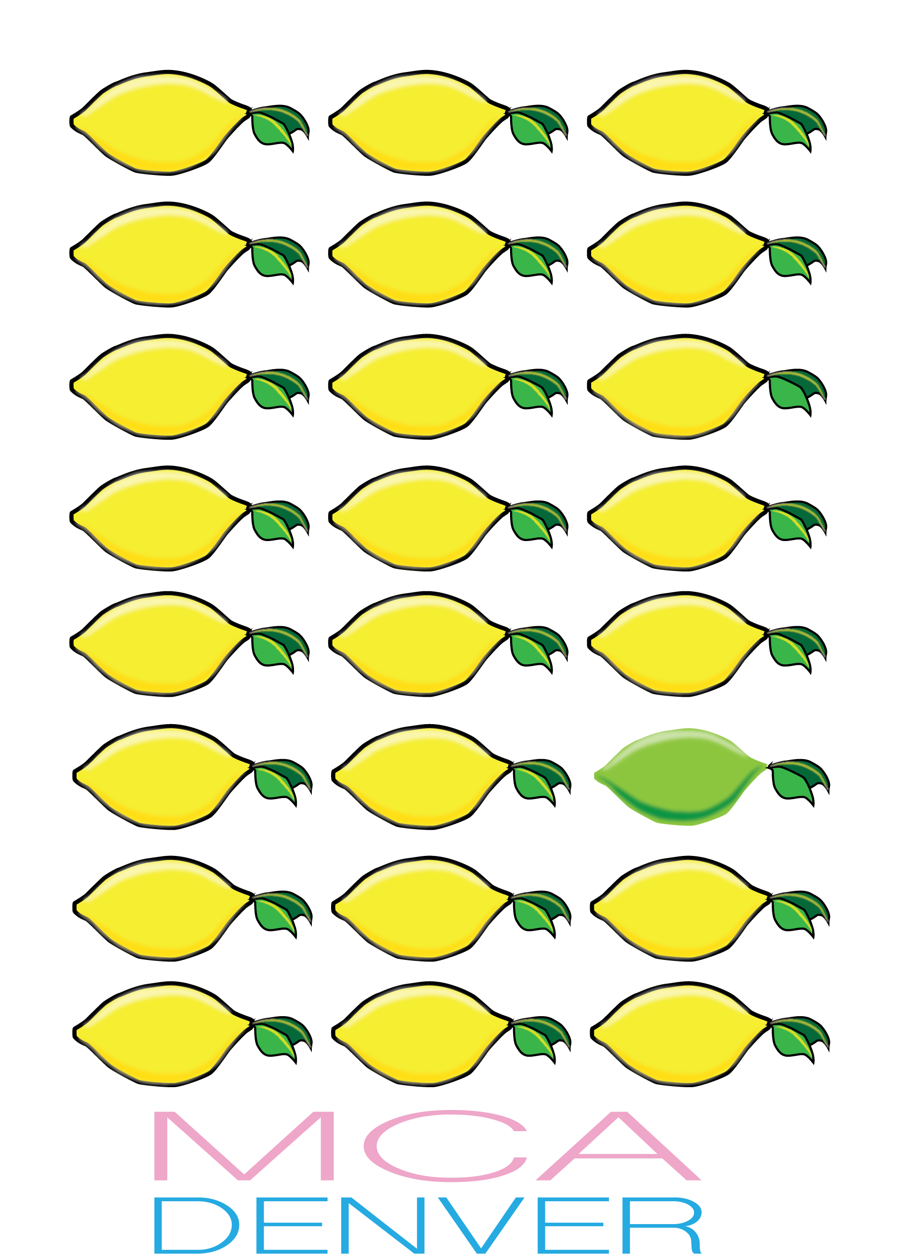
The MCA serves as a cultural hub to spark connections and creativity, and this has never been more important than during the challenges of COVID-19 for our community. I wanted to honor the artists that have come together to make lemonade out of the Lemons handed to them during this trying time, but also recognize that it is the quirky, thinking-differently limes that will continue to push the boundaries and find new sparks of joy at the MCA.
Clair Smith
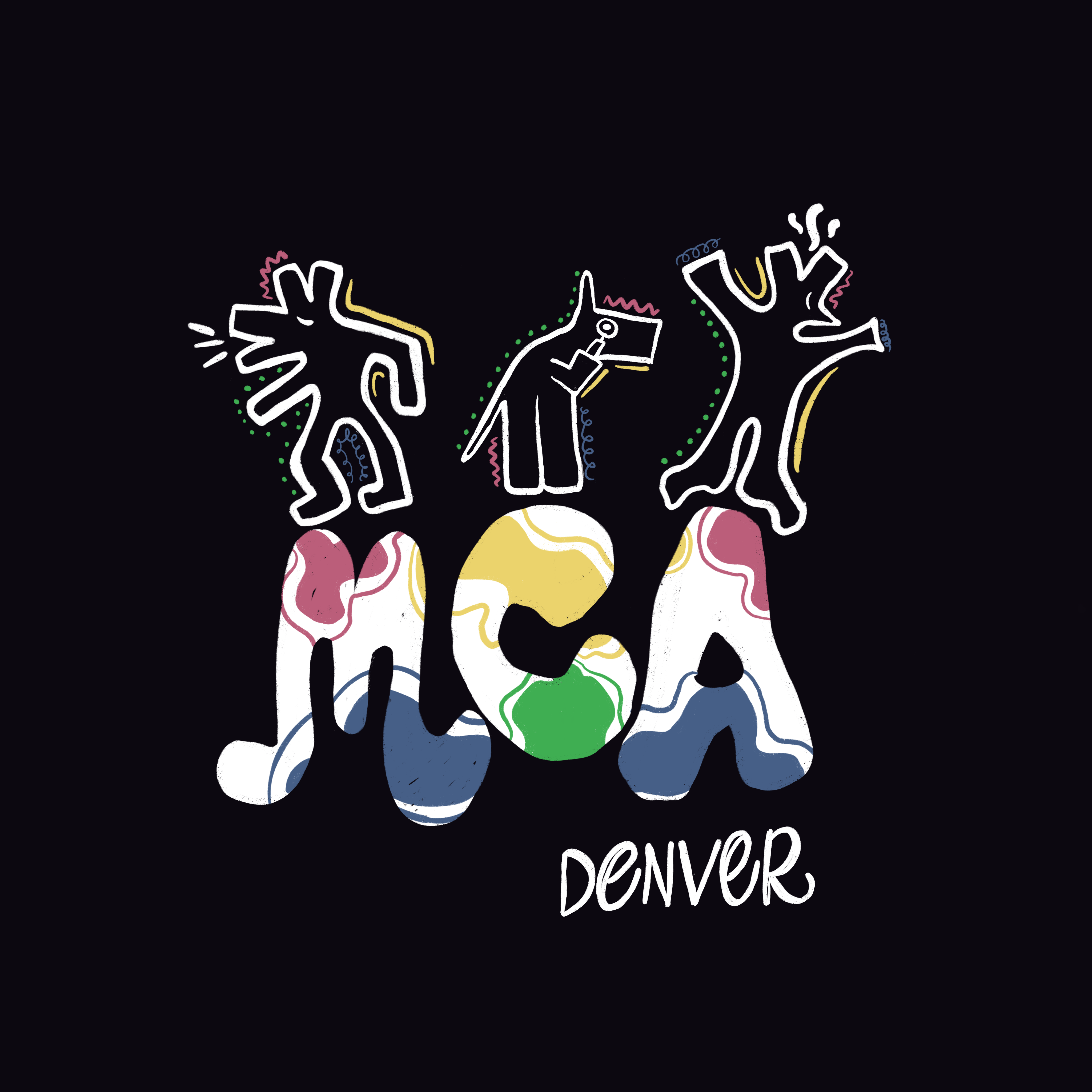
My design stemmed from the Keith Haring “Grace House Mural” Exhibit in March. The MCA vibe was buzzing with constant curiosity paired with excitement at every corner. Creating its own time bubble while expanding your mind.
DARKLINES
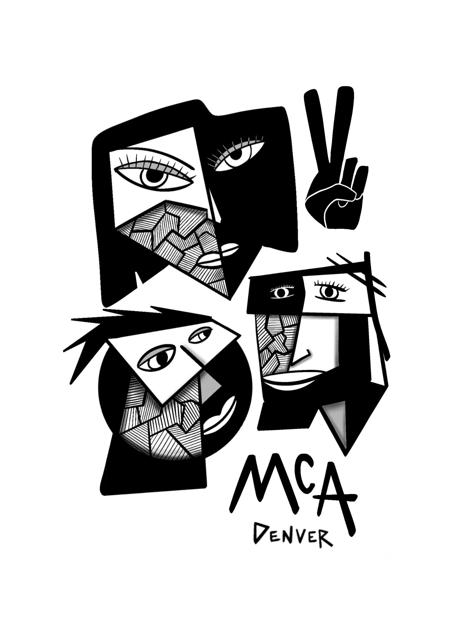
MCA brings in a diverse crowd of people who all share an appreciation for art. My design depicts peace and unity among people of many shapes, sizes, and backgrounds within the walls of MCA Denver.
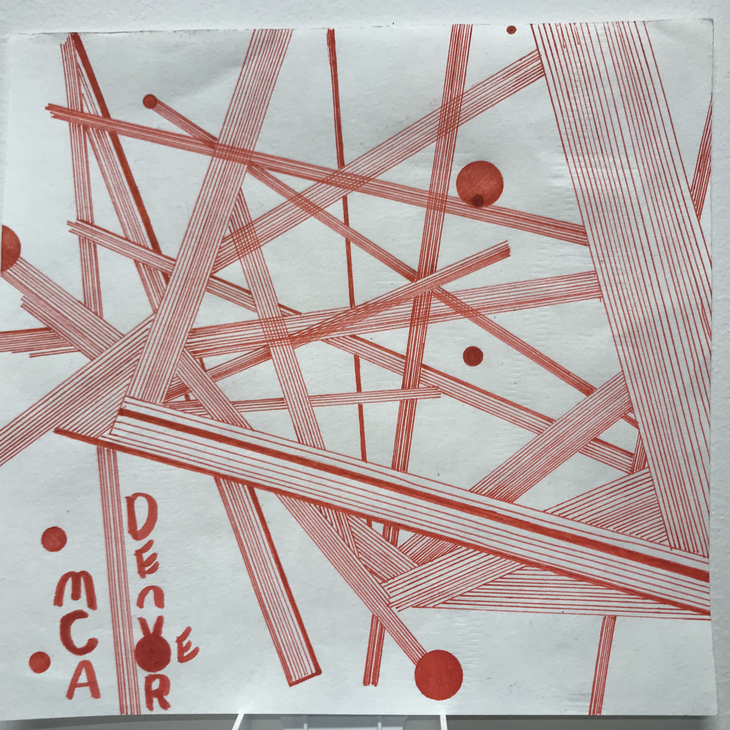
Optical Artifacts
Olivia Ray
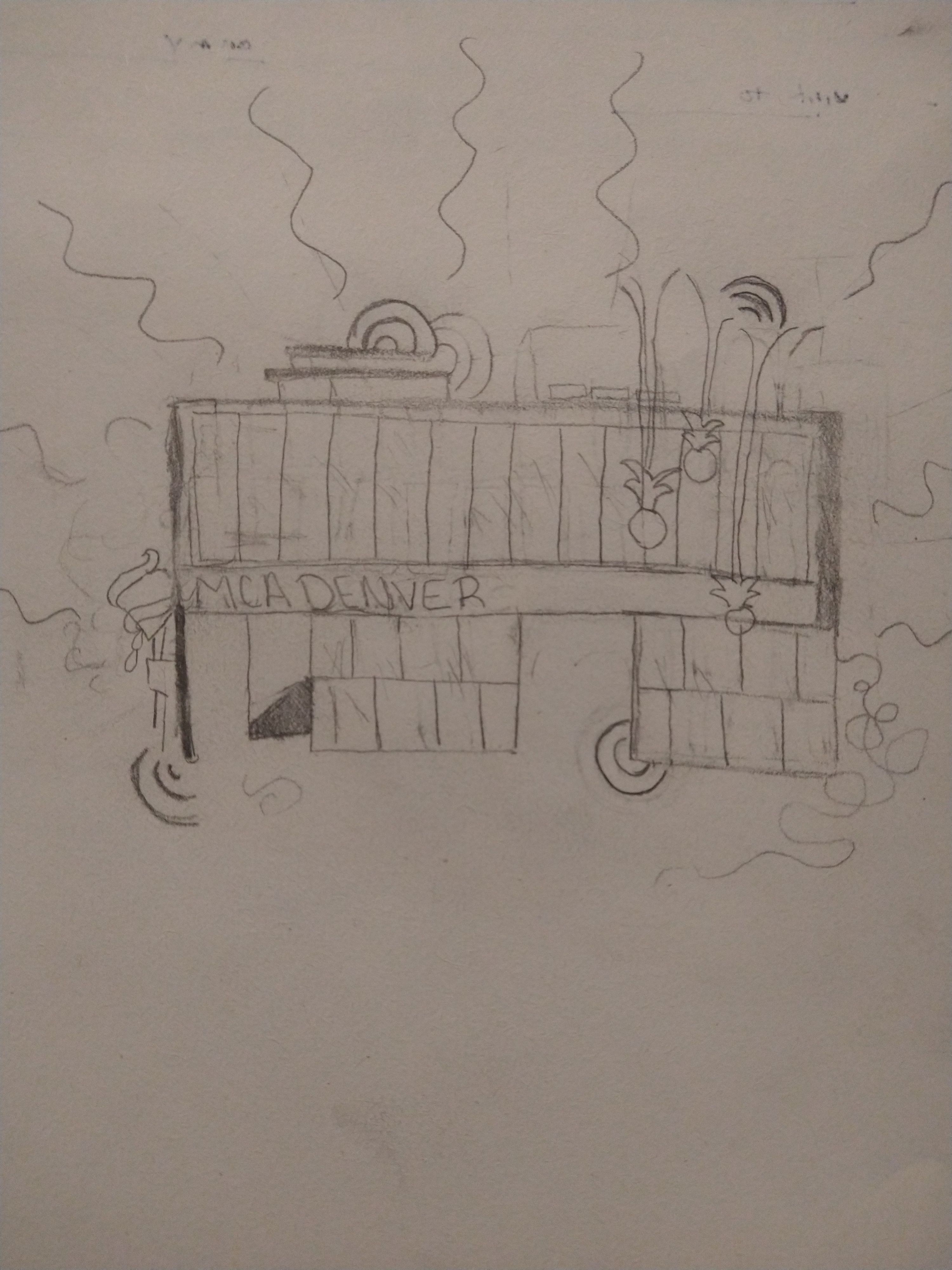
When creating this design I thought, what would be better to represent the museum than the building itself. The plants hanging down represent my favorite exhibit that I saw when I first visited the museum. Lastly the patterns around the museum represent the creativity of the building.
Henrique Lage
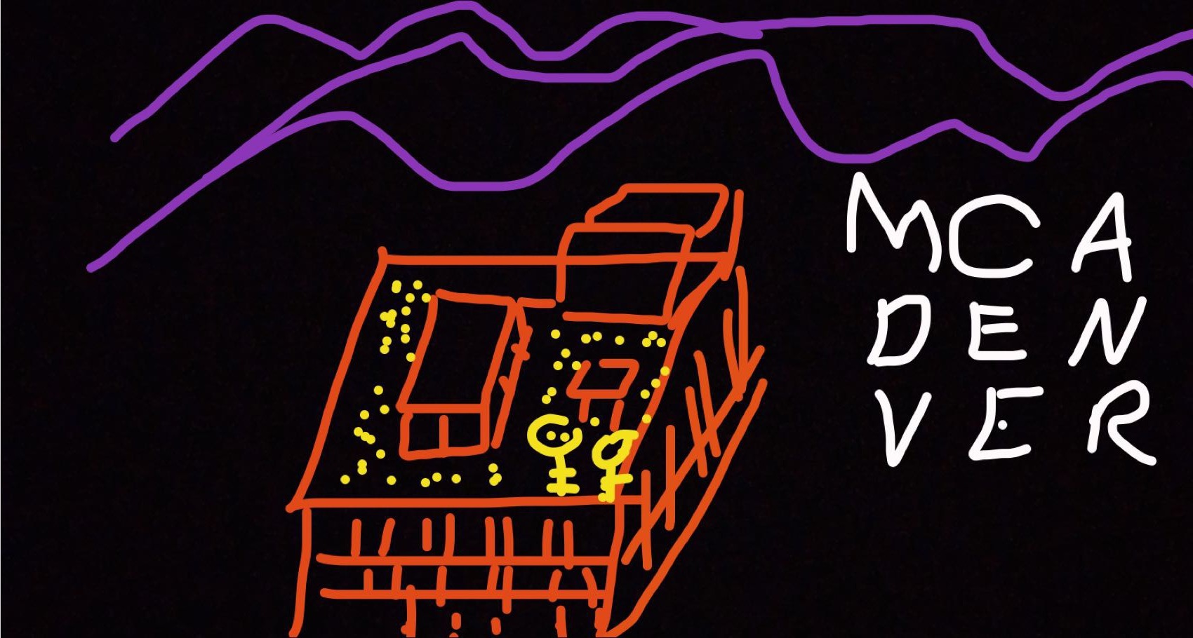
MCA is a stunning place for many reasons. What warms my heart the most about the MCA is its rooftop as a place for the community to gather and share ideas and perspectives that are uniquely formed by being surrounded by our majestic mountains. The conversations and interpretations about what is art / how do we represent meaning visually that occurs on that rooftop is very different from a NYC or LA rooftop.
Zachary Morin
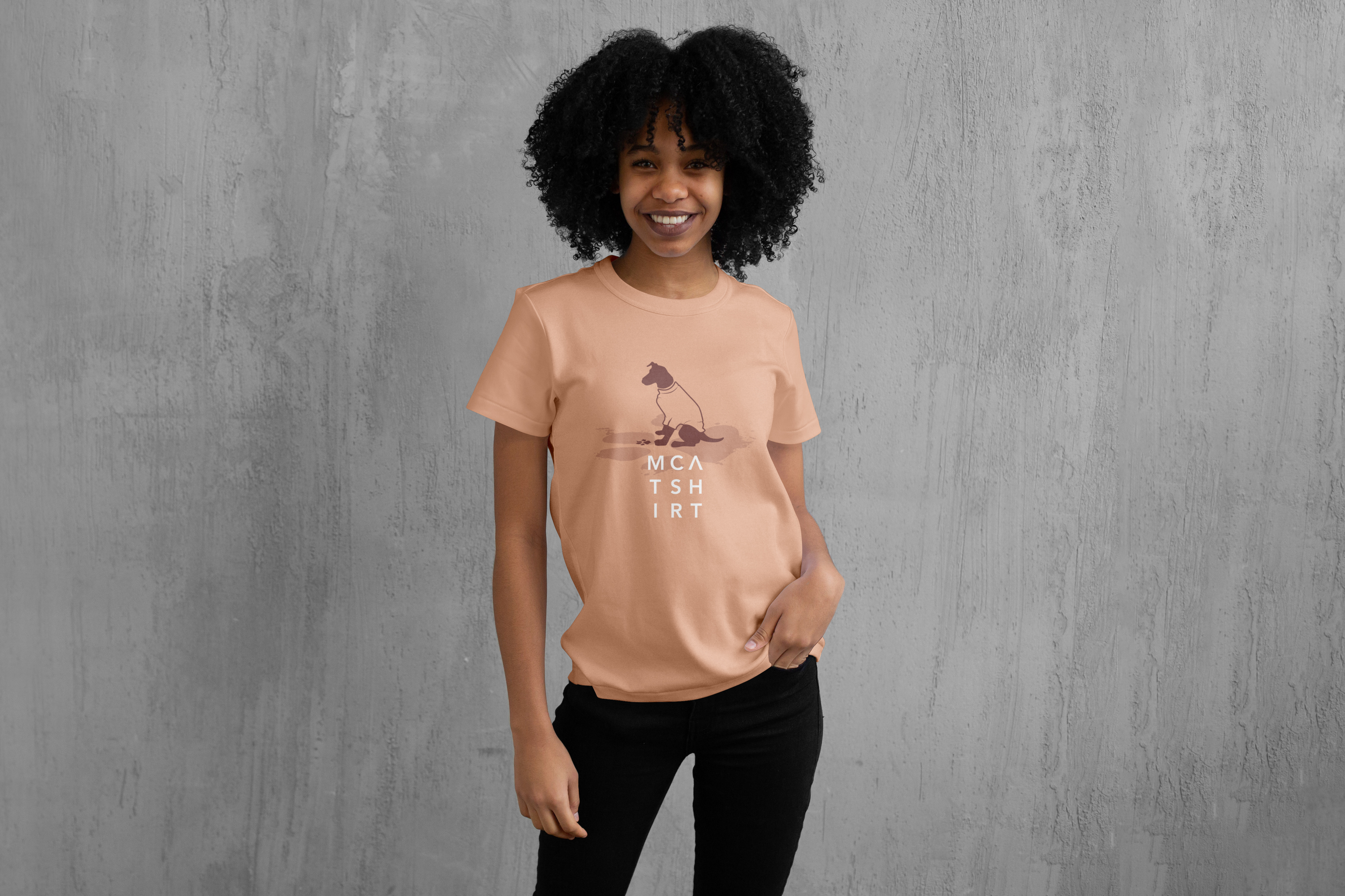
I really like the dog element of the logo, and the story behind how The Lab came to be a part of the MCA family. When brainstorming ideas for a t-shirt, the idea of a dog wearing a t-shirt was just too funny for me to not try out. The thought that the dog itself is an artist attempting to express itself adds a bit more levity and grunge to the design. I also really enjoyed discovering that t-shirt has the same amount of letters as Denver, so that was a nice little type exercise to work into the MCA word mark itself.
Miha Kuerner
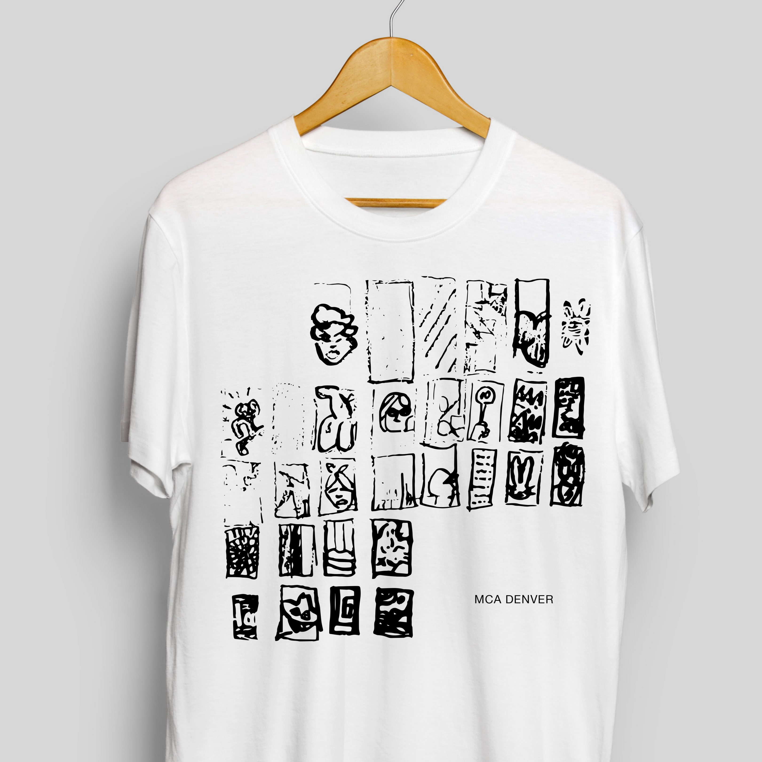
Inspired by the architecture of the museum I drew the entrance side of the museum featuring art pieces from various artists drawn by my interpretation. The idea was to illustrate MCA as the home of all of the contemporary masterpieces. To me, exhibitions are always something special, and even though they are always under the same roof they never feel like it is the same place. Quite on the contrary, transportation through dimensions is guaranteed and this is where I feel the architecture plays an important role as well. I hope people will look at this shirt and get inspired to visit museums. I drew art pieces deliberately indirect and abstract, so it makes one think: “...did I just saw Keith Haring’s dancing man on that shirt?... man I have to visit MCA...:). Here are some of the artists that I included on the illustration: Andy Warhol, Keith Haring, Jeff Koons, Basquiat, Takashi Murakami, Yayoi Kusama, and many others.
Anja Korosec
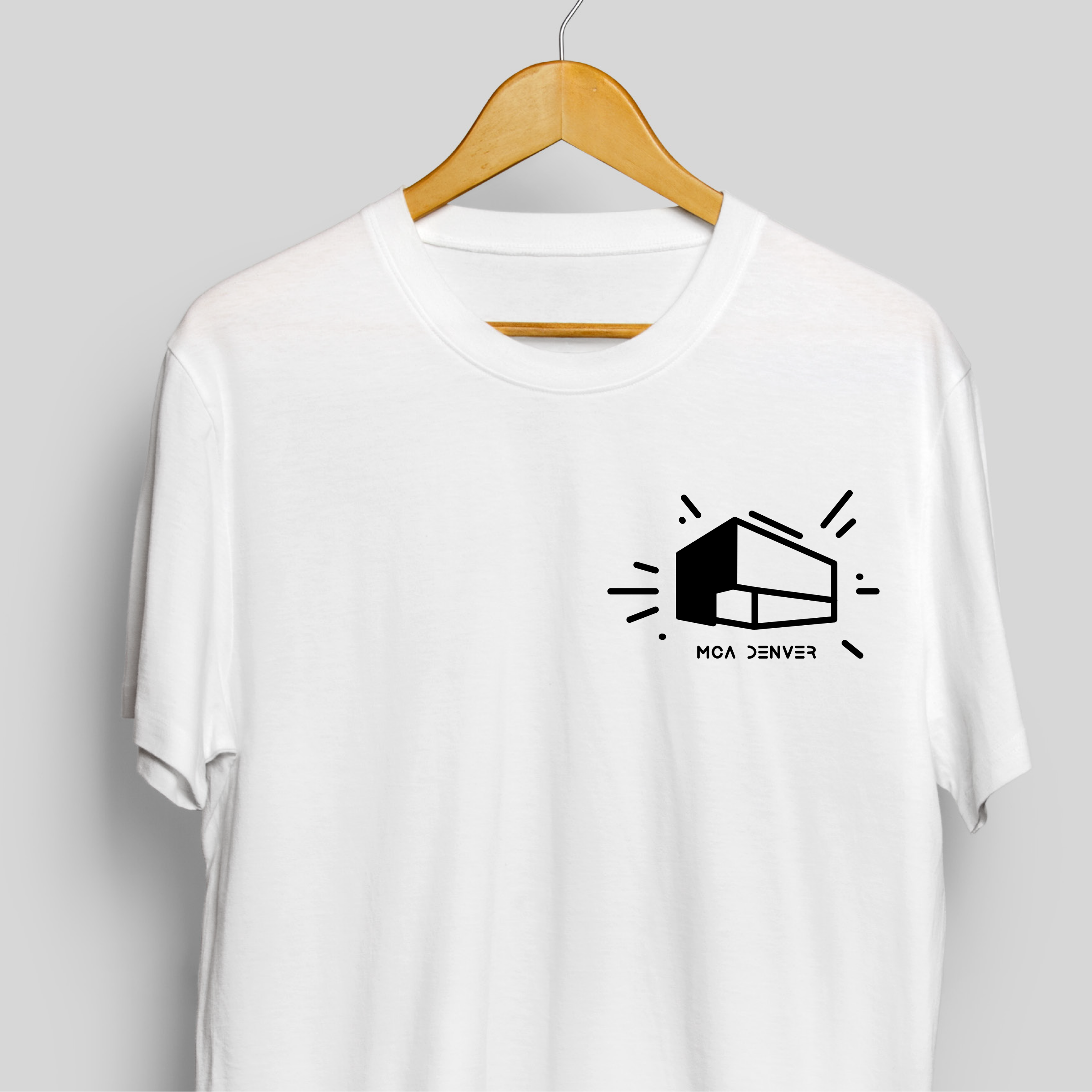
Inspired by the Keith Haring exhibition of murals, that made everybody want to dance and play with his positive shapes. This design features Haring’s famous bold and flexible lines, that are created with a childlike quirkiness and empowers us with energy and vitality. The graphic style includes the MCA’s architecture, which is a signature to the home of contemporary arts. The typography includes the playfulness and how I think Haring would write the name of the museum in his immediate, direct, and unmediated approach to artmaking.
Kevin Trujillo
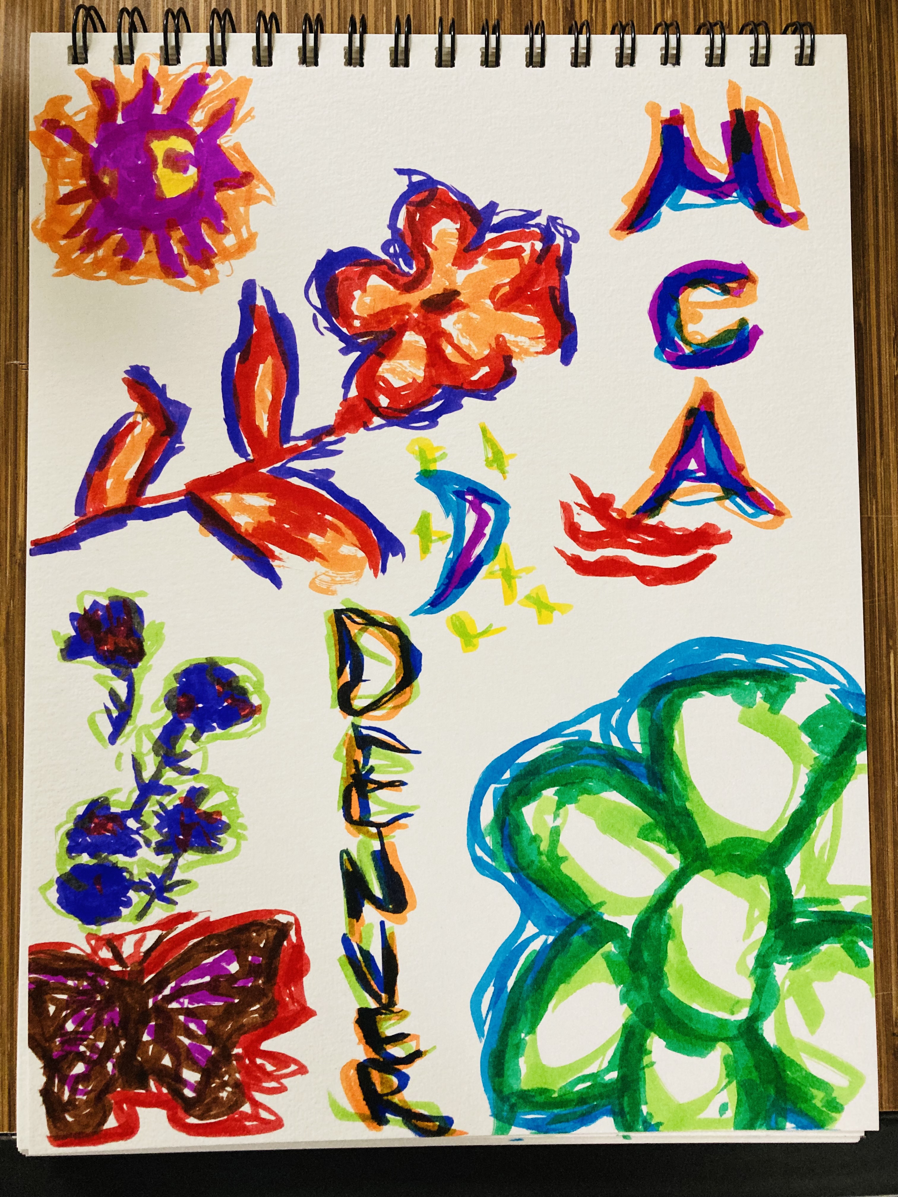
For my drawing I used plenty of bright vivid colors, because in my experience these colors make one feel more energized, and optimistic through the day. I also picked these colors because I was inspired by Denver’s colorful and vibrant murals. I choose the flower drawings, because I wanted to archive harmony using the composition from both curvy and geometric shapes. I wanted to create some sort of polarity by representing calmness, beauty, and nurturing. Just like MCA Denver makes you feel when one is exploring a new exhibition. That’s why I added a sun and a moon drawing. For the MCA Denver logo letters, I decided to make them abstract with vivid colors, because I was inspired by the 2015 Biennial of the Americas presented Now? NOW! exhibition. I remember looking at the variety of techniques that the artists used create their work, which gave me the idea to mix traditional means with more experimental ideas.
Remy Joy Art
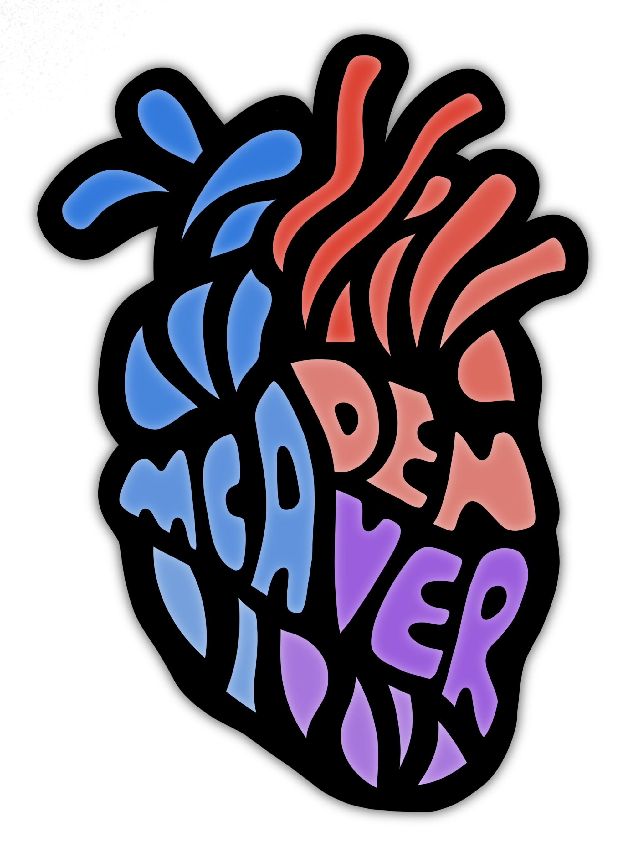
My design for the museum t-shirt is inspired by the idea of art as a common language for our people and planet. This craft sparks feelings of creativity, passion and peace. We ally with an artful awe no matter what we look like, or where we come from - a human heart displays this sense of natural identity and integrity. Art brings cultures together on the basis of designing diversity and innovative intrigue. I hope that my design radiates this energy of human harmony.
Jack Yoder
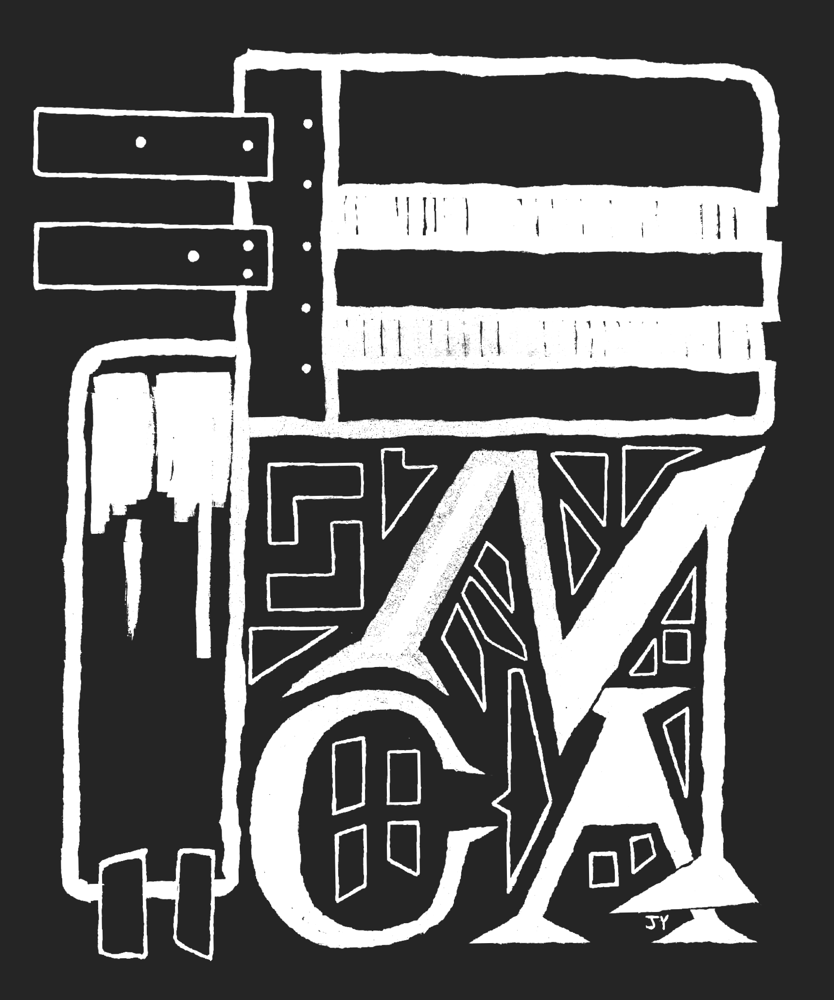
Based (loosely!) on the design of the building and the contents within. In particular, Rick Griffith and Keith Haring. Especially the amount of work it took to preserve the Haring ones.
Gabrielle French
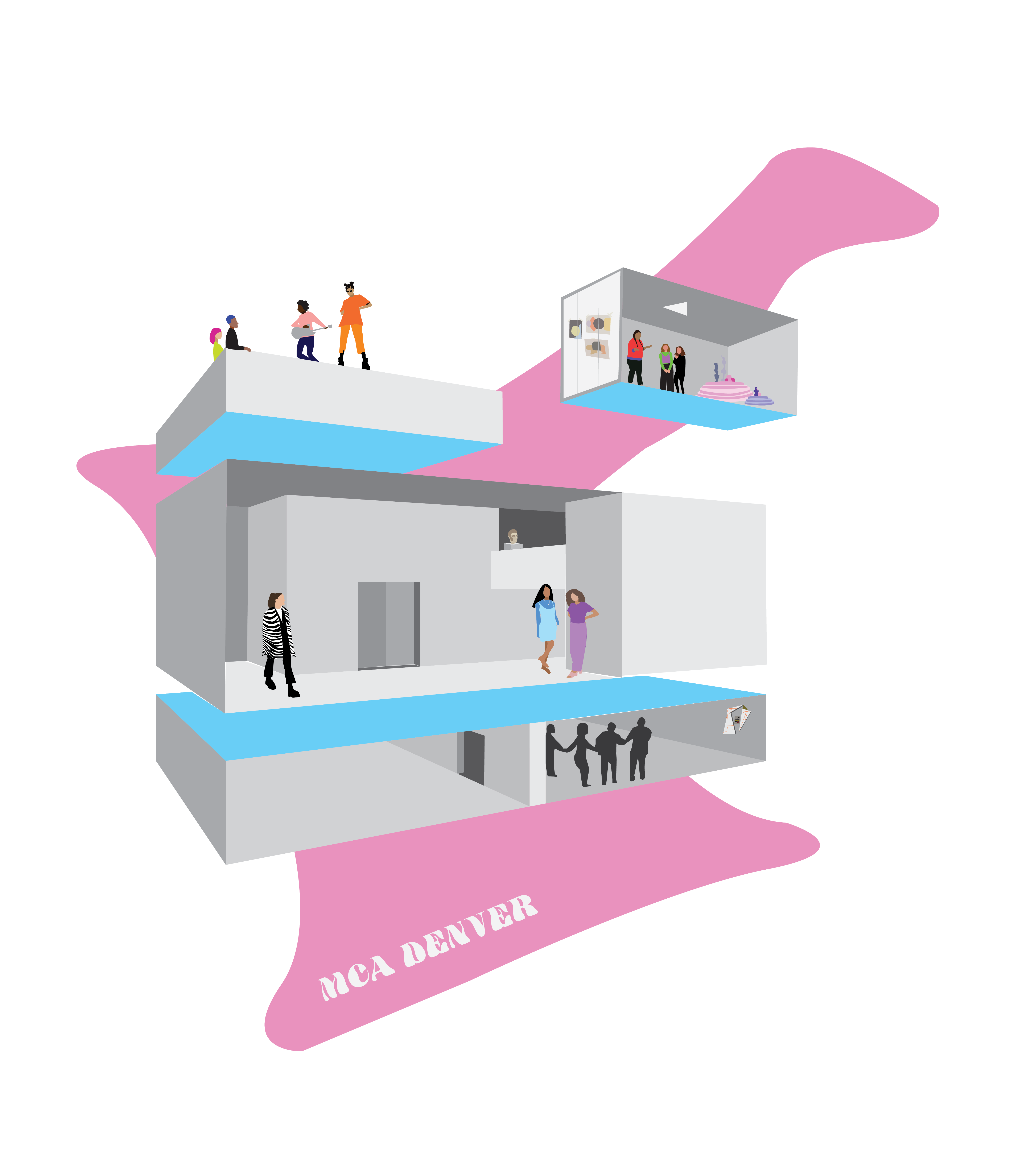
My goal with this design was to capture the spirit of MCA Denver and the wonderful creatives within its walls. MCA is like a second home to me - the place where I’ve spent countless nights soaking in the exhibitions, studying in the cafe, listening to concerts on the roof, dancing at teen parties, making art in the Idea Box. For me, MCA isn’t just about the art. It’s about the people who are drawn to the art. In this design I abstracted the structure of MCA and filled it with the people who make MCA special. Little details like the collages on the Idea Box windows and pieces from past exhibitions bring authenticity to the design and the imperfect, collage-like style mimics the explorative energy of MCA.
Denym Aphrodyte
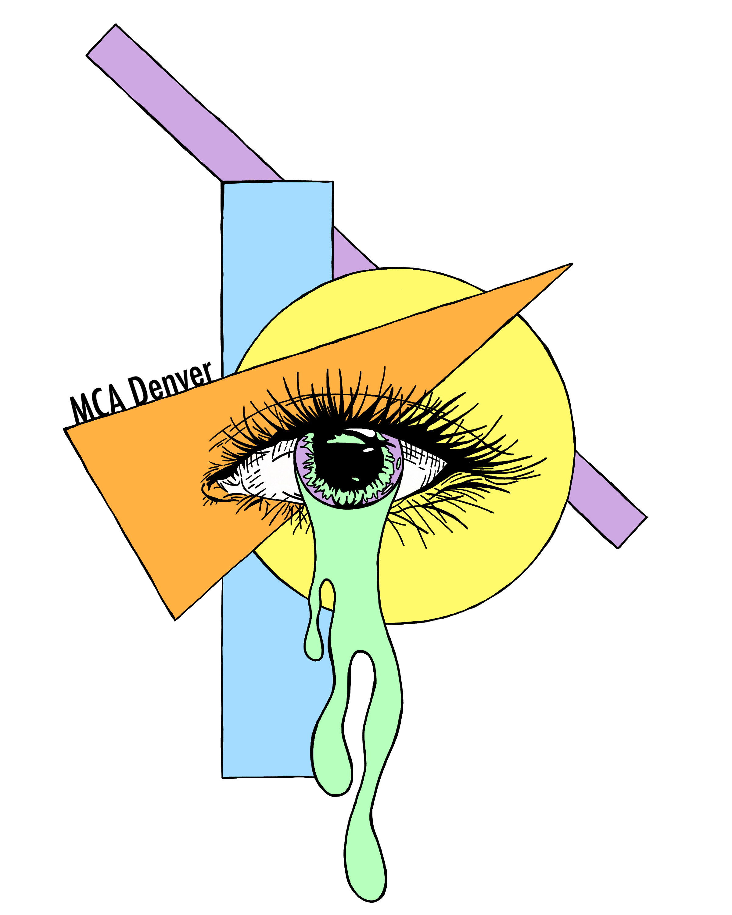
Every time I go to the MCA I experience something new. New art makes me feel awaken inside. It's like opening a portal for self reflection.
Laurel Pierce
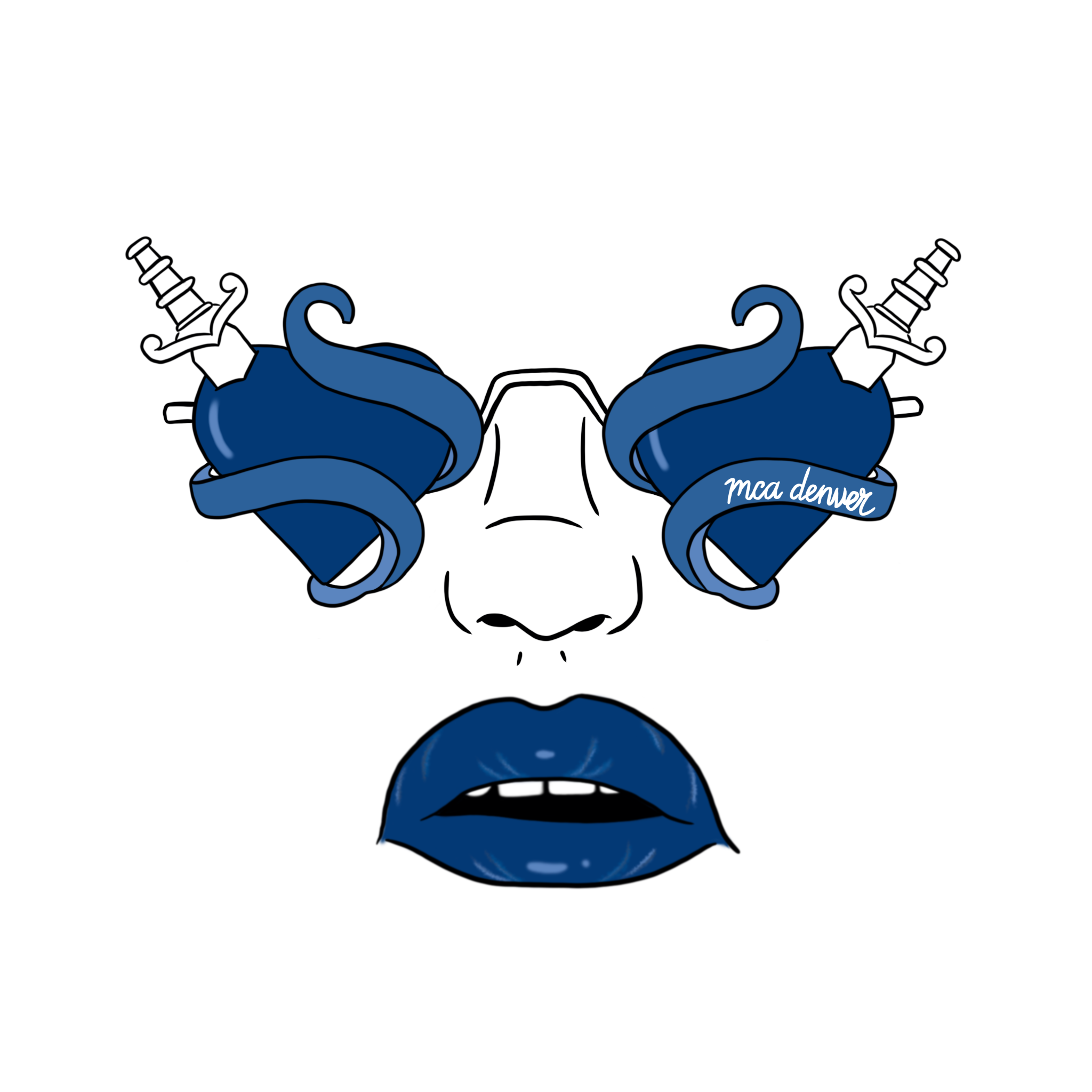
I recently moved to Denver, so I’ve only had the privilege of attending a couple of exhibits at the MCA so far. When thinking about what to design, I landed on something permanent, yet easy to miss. The heart with a dagger outside of the building struck me the first time I visited. Before even entering, you get a taste of what’s to come. That sparked the idea to turn them into sunglasses on a face, because it set the lens through which I saw the museum for the first time - a rendition of rose colored glasses, in a sense. Your experience at the museum can be ever-changing depending on what exhibit is there, but the way the building greets you has a permanence that inspired me.
Monica Jacobs
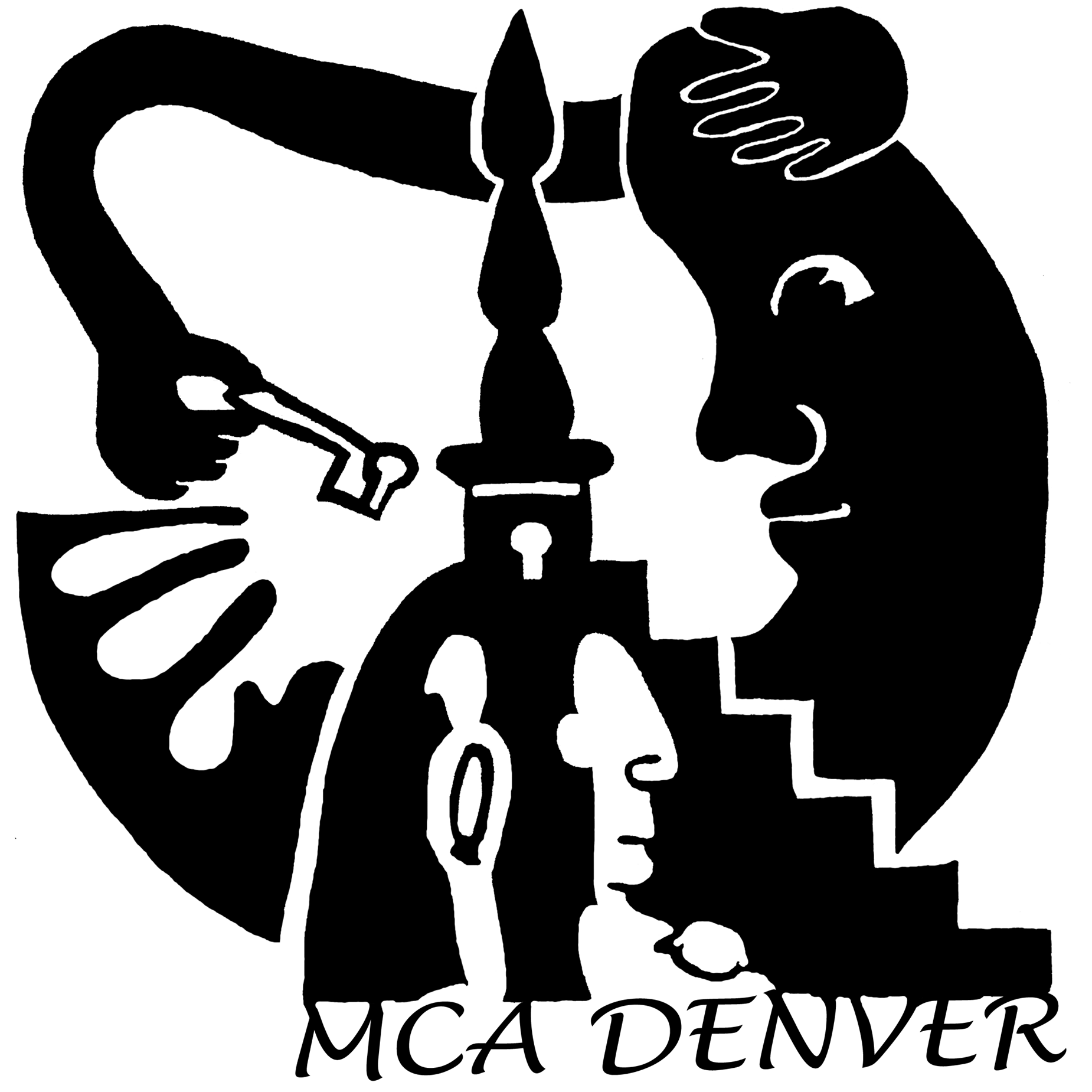
In keeping with how MCA Denver is a community driven, art collaborating center - I worked to incorporate a design that represented a concept of a cycle of sharing, growth & support for each other. Particularly after all that has occurred over the past year, we need to remember the significance of art centers and being a community.
Elizabeth Gregg
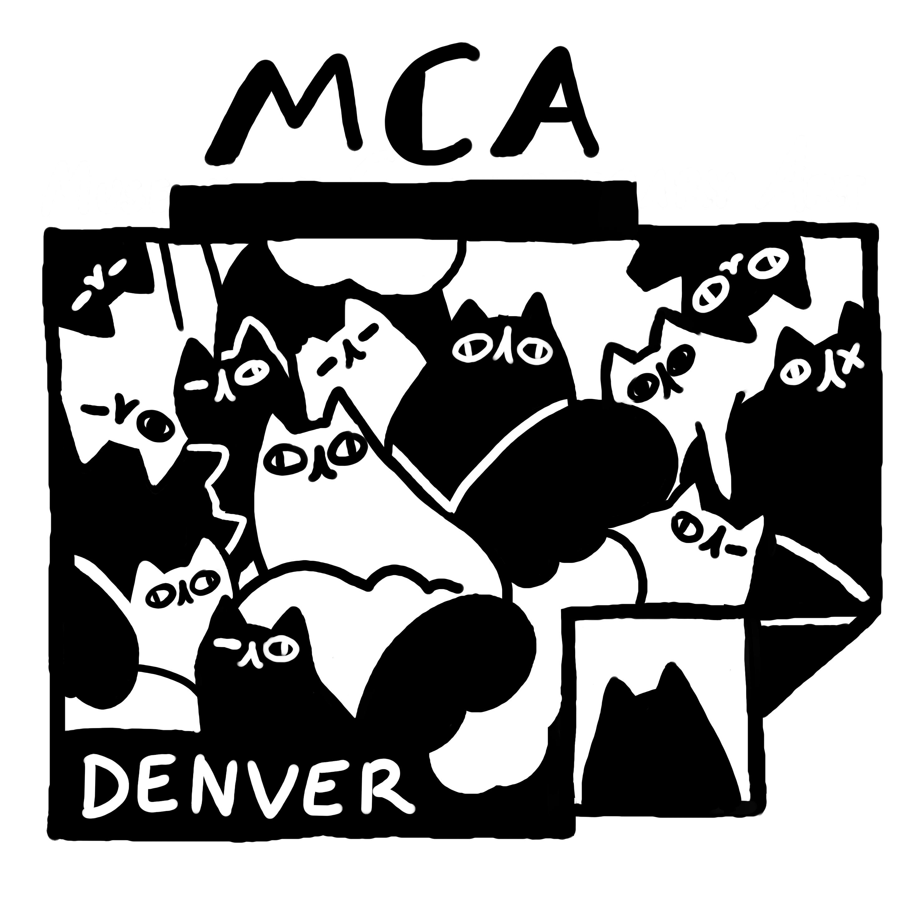
The look of the MCA Denver building has always been so memorable to me, especially with the way that it's sometimes covered in artwork, itself. This, coupled with the playful atmosphere of the museum, is part of why I love it so much, so I reflected that by drawing cats all over the building. ("Kittenish" is a synonym for "playful" for a reason!) As a cat person, I see the same sort of lively curiosity in felines that I see in the museum and its community.
Jeremy Graham
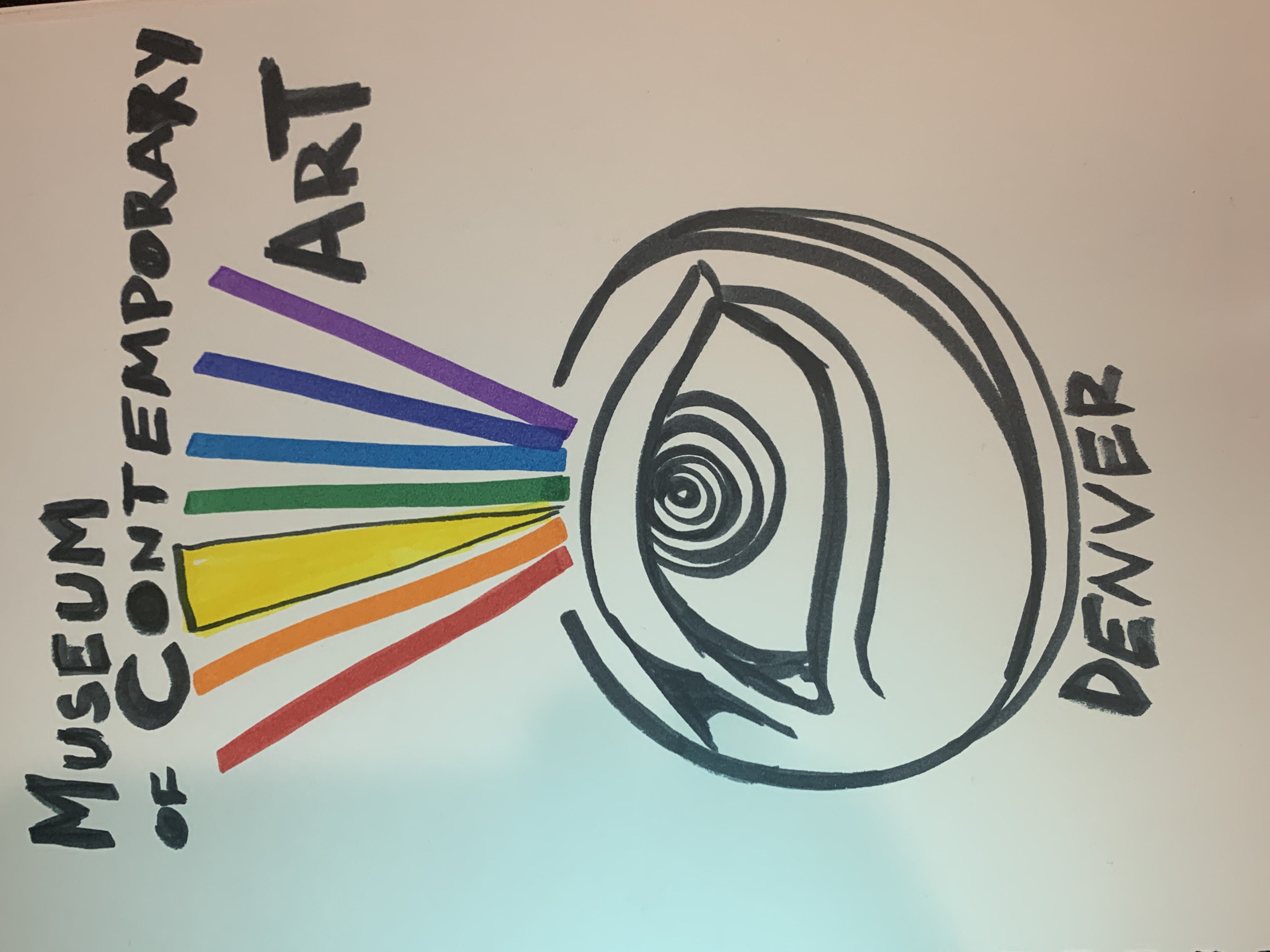
When I see the world through the eyes and execution of artists it’s like a prism changing how I see it. My eyes become a vessel to fill. Once full, I unplug and develop a new point of view or a path to one.
Thomas Mee
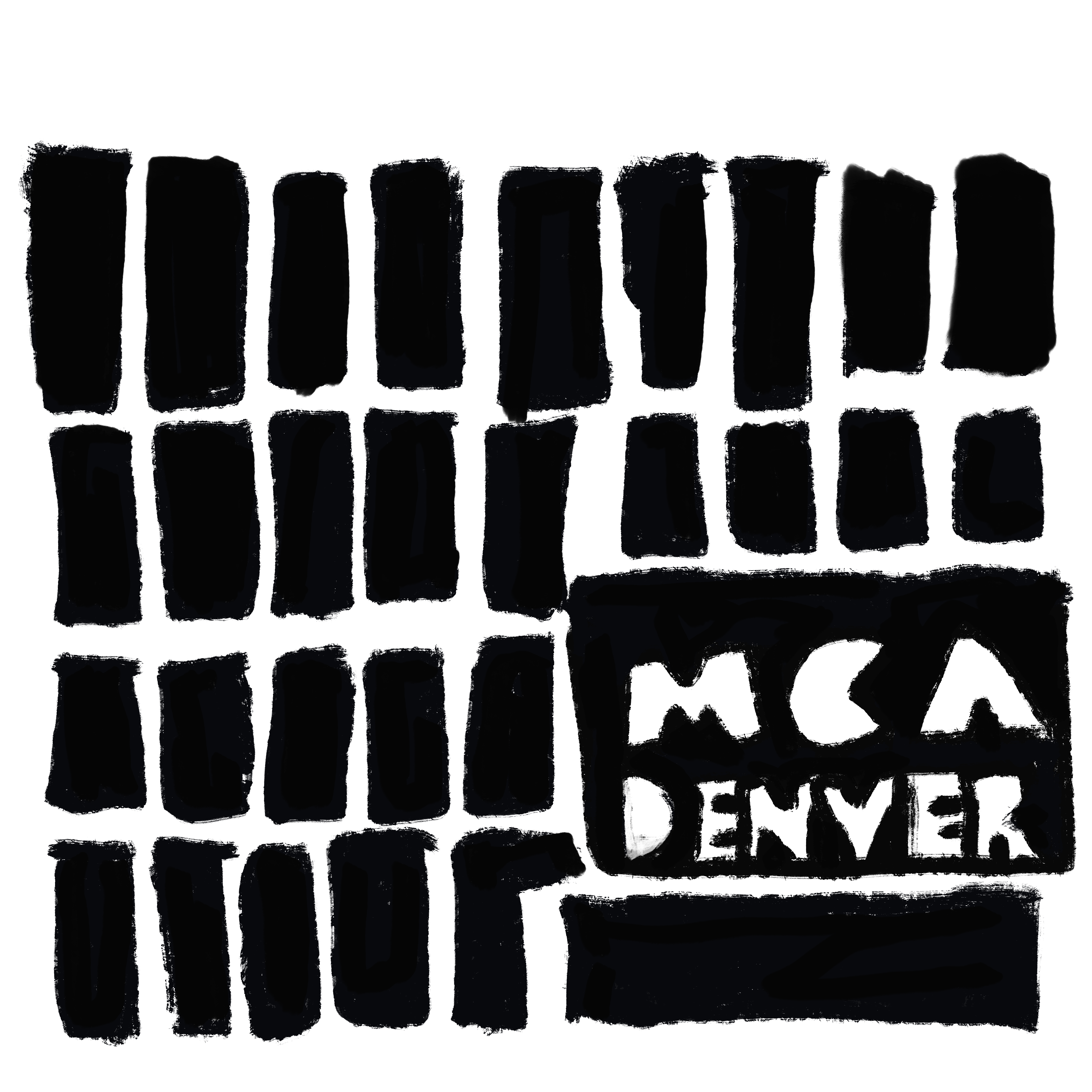
My design is of the east face of the building. It is fashioned after the protest posters of the May 68 uprising. This uprising helped move art into a new space that was more understanding of difference and inconsistencies.
Alex DelleMonache
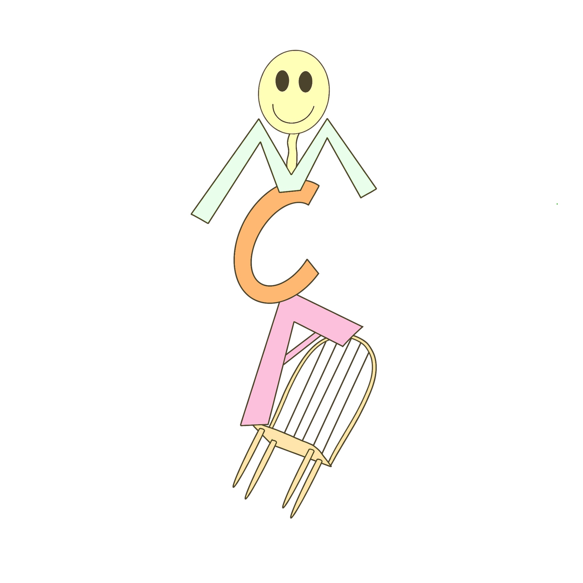
My design was a simple and fun take on how artists featured in the MCA disrupt the art community.
James Geneser
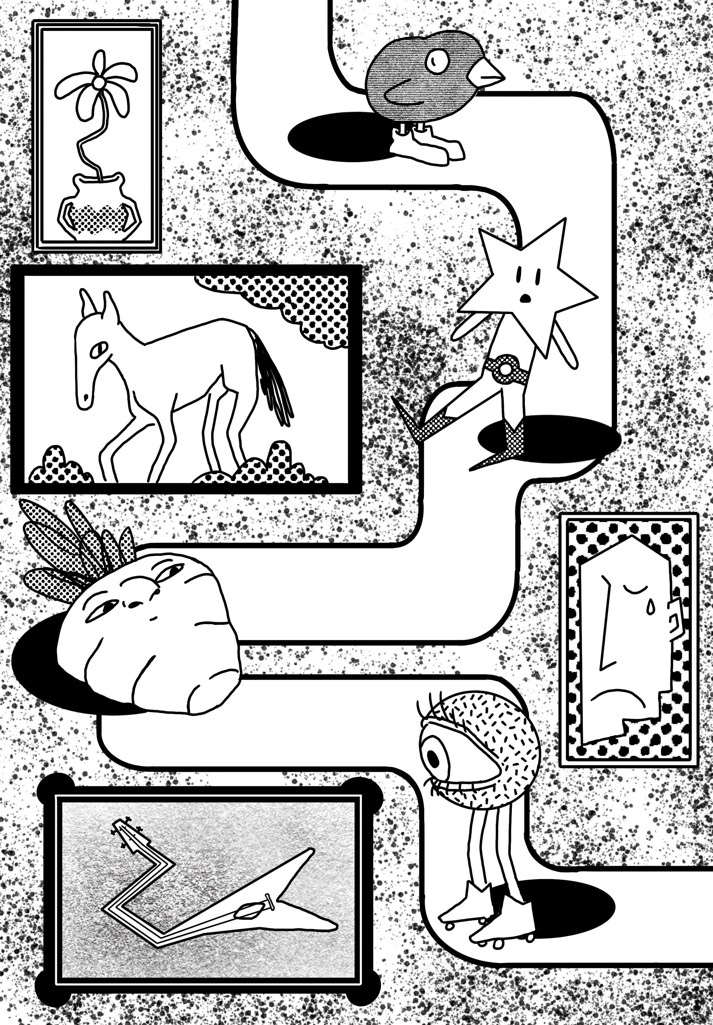
I wanted to capture the delightful strangeness that walking into an art museum can bring. The art and the strangers who walk through the museum with you are all part of the wonderland experience.
Fosterromano
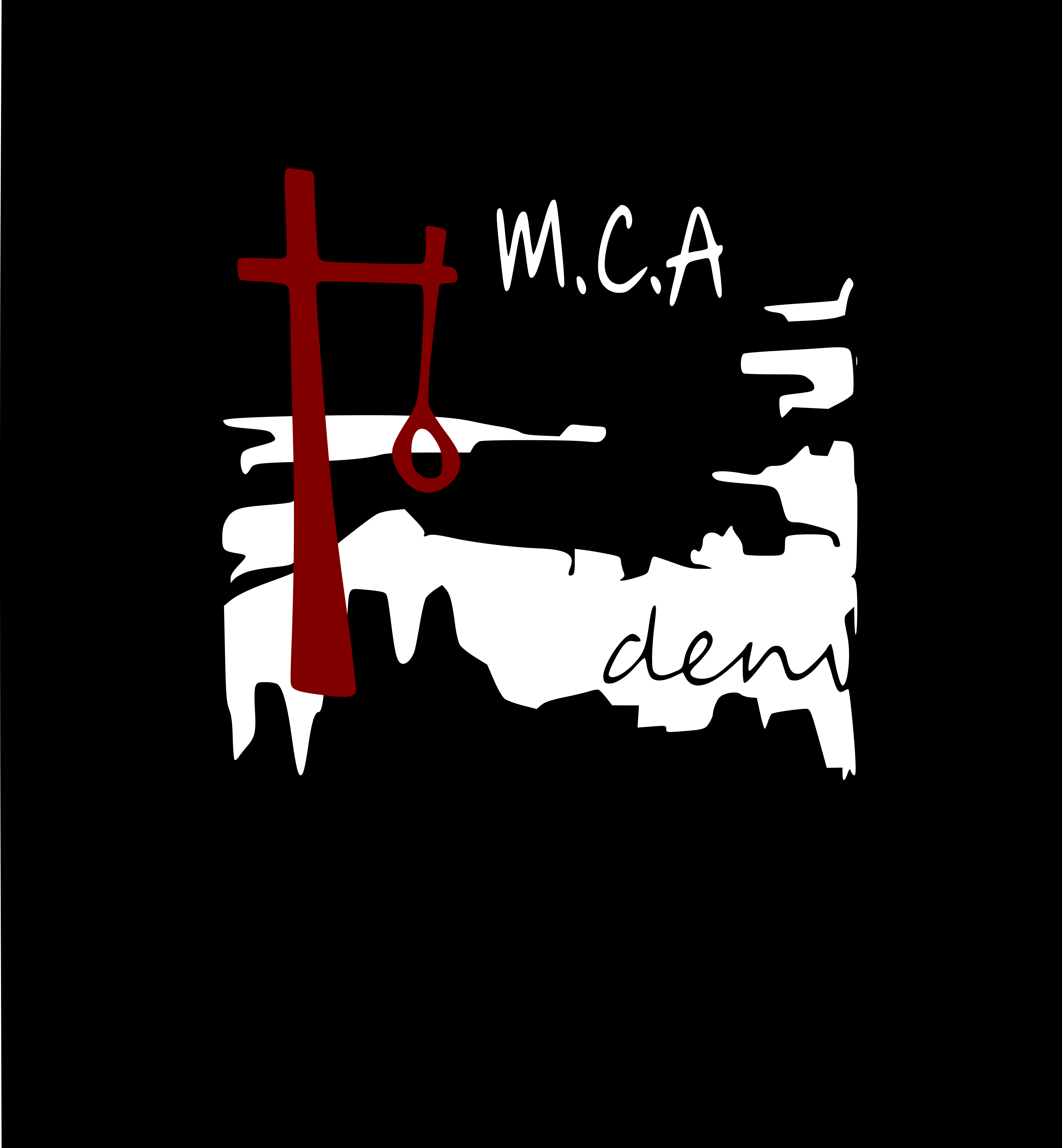
My introduction to MCA was the Cleon Peterson:Shadow of Men show in 2018. I was 14, and it was one of the first museum shows I had seen that reflected street art. Peterson's bold use of color and simple pallet selection inspire me. My t-shirt design includes an abstract rendering of downtown Denver as the backdrop. The red symbol is from my own body of work.
Wayne Steidley
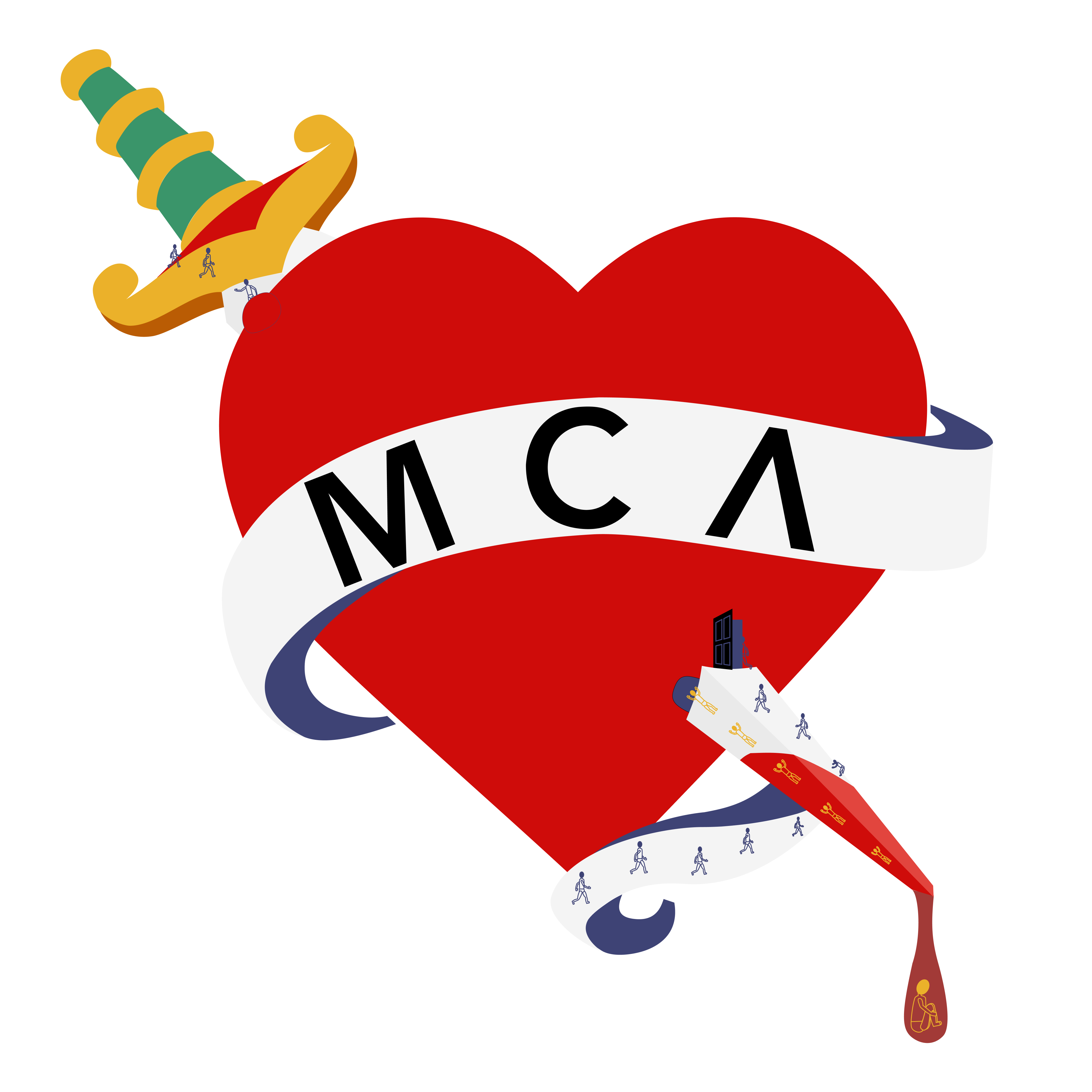
I tried to think of my experiences at the MCA and what my associations are with the museum. The prominent heart sculpture outside the MCA building (Toxic Schizophrenia / Hyper Version) came to mind. I decided to work in the image of the sculpture with the fun, emotional, and transformative experience I've had with the MCA. The tiny people explore and climb higher as they enter the heart of the museum. After reaching the top, the people slide their way down and through the heart once more before emerging changed from their experience and, ultimately, steeping in their feelings.
Denise Zubizarreta
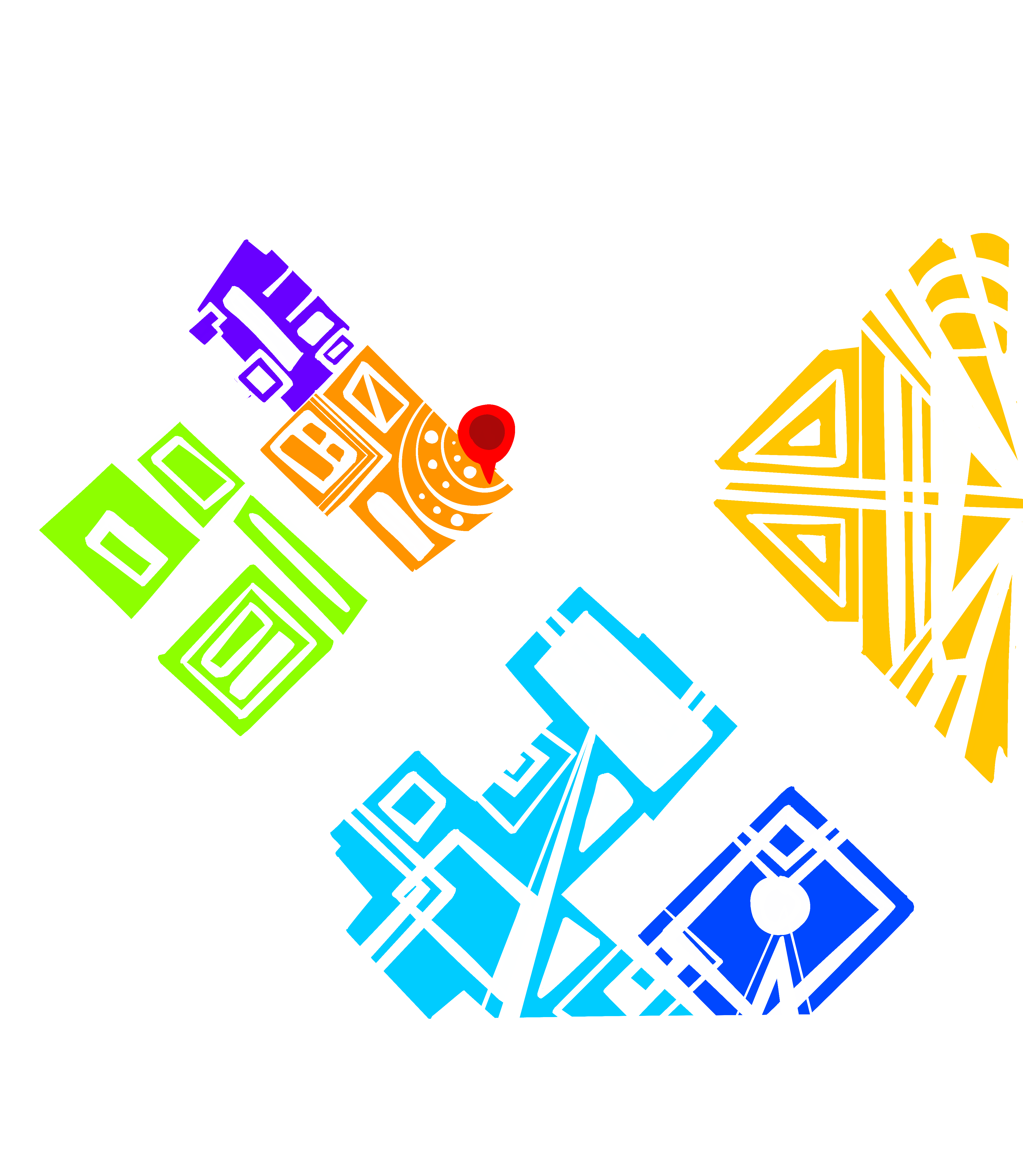
Not long after first moving to Denver I was invited to an event at MCA. I walked from my apartment uptown to the gallery while following Google Maps directions. I remember the feeling and disconnect between the map and the reality of the journey. Once I reached the MCA the light bouncing off the windows cascaded upon the street as if attempting to resonate it’s creative energies to the surrounding community. I was captivated, and to this day the map still fascinates me. All the lines merging and connecting, leading, multiple paths taken, by different people - all part of the artwork they only see when they need directions.